How to Create Landing Pages that Convert!
15th November 2021
What is a Landing Page?
We’re sure you all know what landing pages are but for any of you who don’t, a landing page is a static page that acts as a door to your website. Designed to convert visitors into leads, these pages are ones the customers “land on” usually as a result of the previous marketing promotion.
A landing page is able to carry, introduce and guide the user to a brand as well as carry the user through the brand’s customer journey, with the final destination of completing a Call-to-Action. Whether that’s signing up to a newsletter, purchasing a service or product, or something entirely different – this list is endless!
What makes a good Landing Page?
Whether you are trying to drive sales, collect leads or do something entirely different, landing pages help keep your audience focussed on a specific campaign. Doing what your website can’t by honing in on a specific conversion goal. But what do you need to factor in to make sure you reach those goals?
Keep it Concise
A landing page should offer up all the necessary information that your visitor needs. But try to keep it concise and to the point. Be careful not to overwhelm them with a long page that waffles on. Focus on providing essential information that will engage your audience. Using an effective headline and hero shot will capture your customer’s attention. Then move down to the features section to provide a little more detail and answer any remaining questions.
Clear Call to Action
Litter your page with CTA buttons in relevant places. After all, the reason for creating your landing page is to convert users. It is essential that you use clear Call-to-Actions telling users what you want them to do. Make it easy for them to convert to avoid a large drop-off at this point. A simple, clean yet eye-catching design is what will help you land conversions.
Use Social Proof
How many times have you endlessly scrolled through hundreds of reviews before making a purchase? Yeah, us too! Social proof is a powerful tool of persuasion. Users are much more likely to convert if they see that previous shoppers have (and benefited from it)! In fact, on average a consumer reads 10 reviews before trusting a business.
Engaging Hero Shot
We’ve already mentioned that good design is essential. The hero shot – the first image a user will see when they land on your page, needs to be relevant and impactful. It’s a visual representation of what you are offering. Combine your visuals and copy to tell an engaging story. Place your customers as the hero of your story so they see themselves in the scenario where your product/service is essential.
Why should you listen to us?
Over the past few months, we’ve been developing a range of landing pages for our clients. We redeveloped a range of landing pages for our good friends at Vastern Timber to engage their customers and guide them to request a quote. We start by landing on a high-quality image showcasing what Vastern Timber can offer. With a question to get users engaged and conversion call-to-action. This same call-to-action button appears again at the bottom of the page and we have other CTA buttons throughout such as download guide and see prices.
There is a sufficient amount of information on this page with links to other pages including case studies and the resource centre to reinforce how knowledgeable Vastern Timber is in their field. Finally, we’ve included a 5-star Google review to increase trust in the brand.
And it has worked! In the first month of using these new landing pages, goal completions increased by 171%!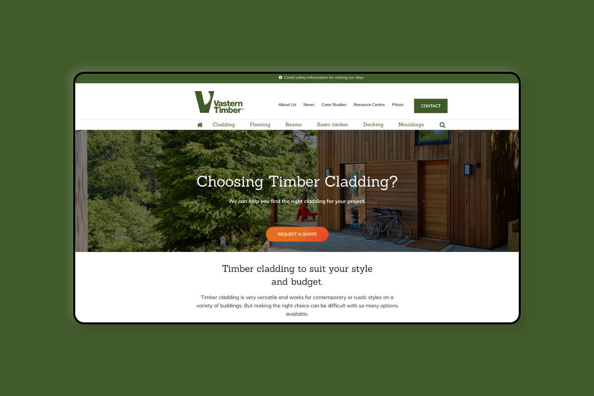
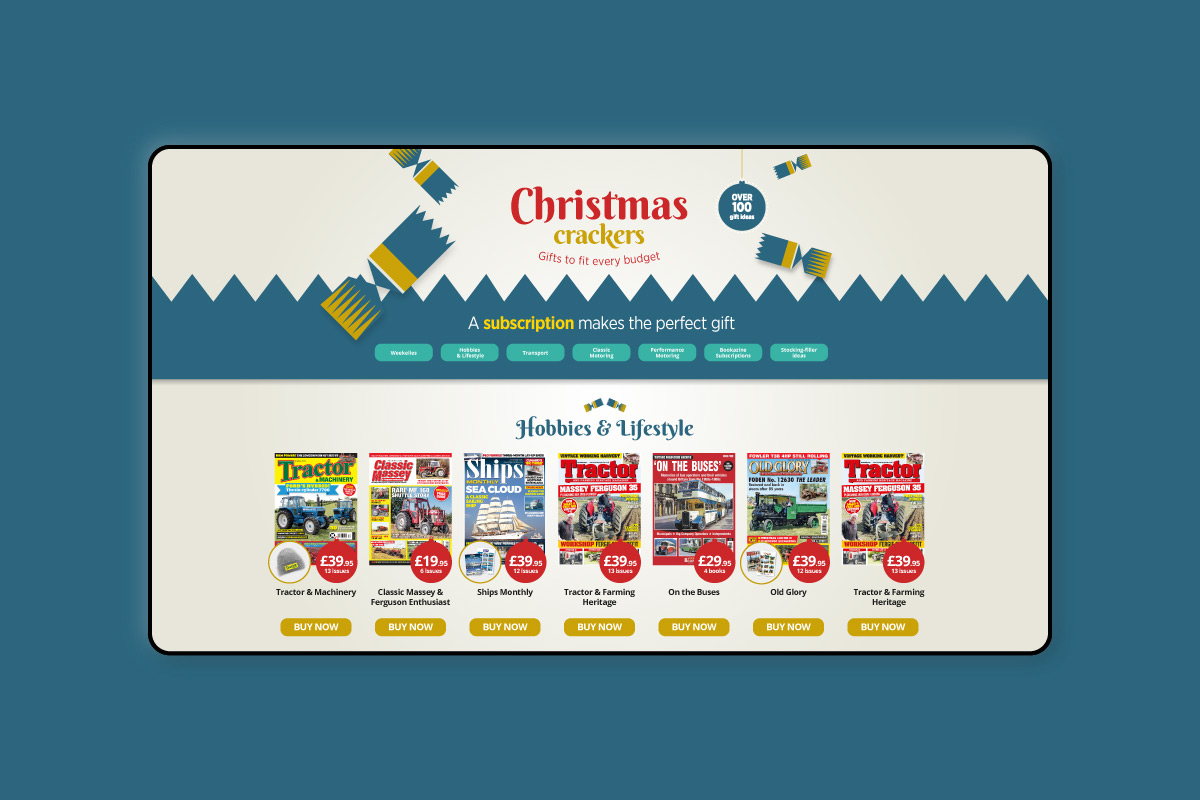
Seasonal Landing Pages
Seasonal Campaigns are an essential time to develop landing pages. We have been working closely with Kelsey Publishing to create impactful pages for their Christmas campaigns. Kelsey started running paid search and social campaigns to drive sales for Christmas. To increase their conversion we developed an on-brand, on-trend landing page. With a clear statement at the top followed by clear categories to filter to show suitable gifts for the relevant recipient, the first section customers’ eyes land on clearly directs them through the journey. Followed by clear images of each magazine with the bonus gift highlighted and a clear ‘View Offer’ CTA.