Does Colour Choice Really Matter in Packaging Design?
23rd October 2023
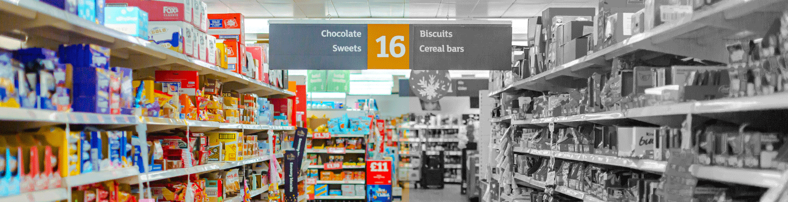
Imagine stepping into a bustling store, surrounded by hundreds of products competing for your attention. Which one grabs your eye? More often than not, it’s the packaging that speaks to you. But does the colour you use in your packaging design really matter? The answer is yes. In the world of packaging, your choice of colour isn’t just about aesthetics; it’s a tool that shapes consumer perceptions and influences their purchasing decisions. In this blog post, we’re going to discuss why colour is so influential in packaging.
So, what’s the psychology behind using colour in packaging design?
Colour transcends the visual; it’s intricately linked to human psychology. Research tells us that up to 90% of initial judgments about products are based on colour alone. Different colours evoke diverse emotions and associations. Warm tones like red and orange can incite appetite and excitement. While cooler hues like blue and green convey calmness and trust.
Colour becomes an invaluable tool for brands aiming to evoke specific emotions and build strong connections with their target audience.
How the colours used in packaging designs impact consumer behaviour
When we talk about the impact of colours in packaging design on consumer behaviour, it’s essential to understand that colour is a powerful tool in shaping how people perceive a brand. The statistics tell a compelling story. Research has demonstrated that having a signature colour can substantially boost brand recognition by as much as 80%. This means that when consumers see that specific colour associated with a brand, they instantly recognise it, creating a powerful connection.
Furthermore, it’s not just about recognition; it’s about influencing buying decisions. In fact, a remarkable 63% of consumers have admitted to making repeat purchases solely because they were drawn to the appearance of the packaging. This statistic underscores colour’s undeniable role in influencing consumer choices.
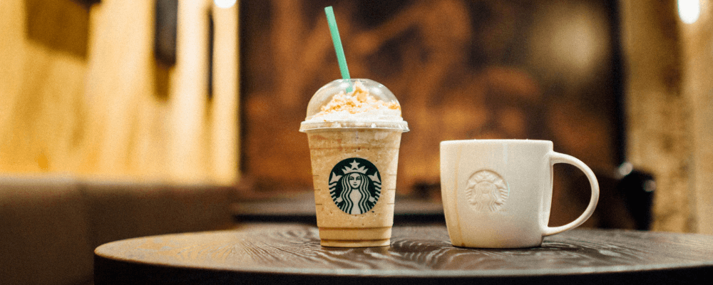
For instance, consider global giants like Coca-Cola and Starbucks. They aren’t just known for their products but also for their strategic use of colour. Coca-Cola’s iconic red packaging and Starbucks’ unmistakable green logo set them apart in crowded markets. These brands have harnessed the psychological power of colours to create lasting impressions, evoke emotions, and ultimately drive consumer loyalty and sales.
Brands that use colour in their packaging the right way
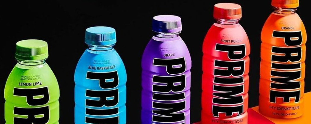
Prime
In the wake of the recent media frenzy, the Prime bottles have ignited the world’s attention, leaving a mark with their striking and vibrant packaging. This surge of interest isn’t by chance. It’s a strategic move that mirrors the trend of using on-trend ecstatic colours to entice a younger audience. Notably, influencers like KSI and Logan Paul harnessed the power of these vibrant hues to resonate with their youthful fan base, driving a substantial increase of more than $250 million in retail sales.
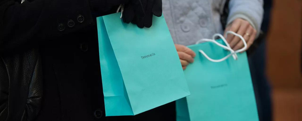
Tiffany & Co
Moreover, consider Tiffany & Co.’s iconic robin’s egg blue that epitomises luxury and sophistication, instantly communicating a sense of exclusivity. This colour is so distinctive that it has its own exclusive Pantone code of 1837 and is officially trademarked by Tiffany & Co.
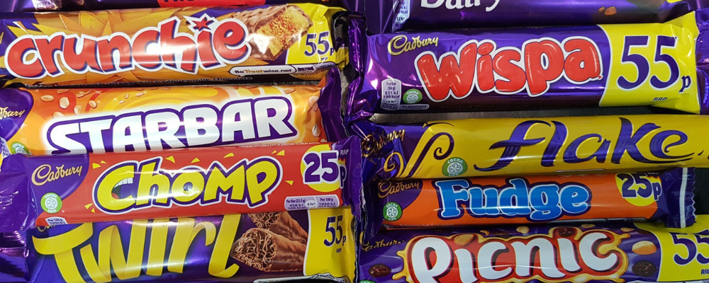
Cabury’s
Shifting the spotlight to chocolate, Cadbury’s distinctive purple packaging enters the scene, a vivid choice that stands out on store shelves. Selling a staggering 350 million bars of Dairy Milk annually, the regal purple packaging uniquely distinguishes the brand.
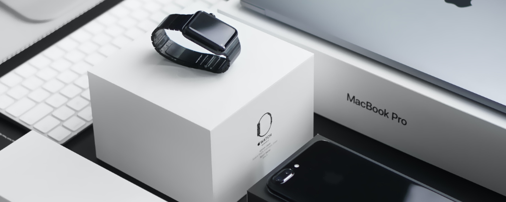
Apple
Meanwhile, Apple’s minimalist packaging design, predominantly pristine white with a modest logo, speaks volumes about the brand’s unwavering dedication to innovation and refined aesthetics. The subdued yet sophisticated colour palette emanates modernity and elegance, clearly resonating deeply with consumers, so much so that it’s often found that people will save their empty apple boxes.
These examples demonstrate how strategic use of colour not only captures attention, but also creates lasting stories about a brand’s identity, values, and the strong connections that bind consumers to their favourite products.
For instance, if we were to ask you what brand is associated with the colours – yellow and red – would you be able to answer?
How we’ve used colour in our packaging design to tell a story
Boka
Boka had a mission: to create snacks that were not only healthy but also delicious. With their expertise in manufacturing, they had the production aspect covered. However, they needed help with their design and marketing. The challenge was twofold: to craft visually striking packaging that would grab attention on supermarket shelves while appealing to a broad audience.
From the very beginning, the goal was clear – to produce the ultimate “All Green Traffic Light” cereal bar, signifying low levels of sugar, fat, saturates, and salt. In our packaging design, we carefully considered all these factors. We believe that healthy snacks shouldn’t equate to dull packaging. Thus, we infused vibrant colours to represent the diverse range of flavours, ensuring that healthiness met eye-catching appeal.
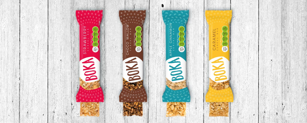
The results were impressive with Boka securing a spot on Sainsbury’s shelves. Furthermore, they successfully launched their very first TV advertising campaign with the children’s TV network Nickelodeon. This campaign, named “4 Green Lights”, aimed to promote their healthy snacks and nutritional value; colour played a pivotal role in making these products visually appealing to both children and parents.
The challenge ideas and come up with innovative ways to push the brand forward whilst raising awareness across all channels. Their skills and experience of all aspects of design and marketing is a real advantage as I can get everything I need from one agency.
Franco Beer, Founder of Boka Food
Napo
When we designed the packaging for Napo, we used a colour palette that told the story of friendship and sophistication. We used a golden hue to quite literally represent the yellow of a lemon, but on a more metaphorical level to convey the happiness represented with friendship. The golden contrasted against the green helped to represent luxury and refinement. The design and execution were a massive success, and we heard some fabulous feedback from our client.
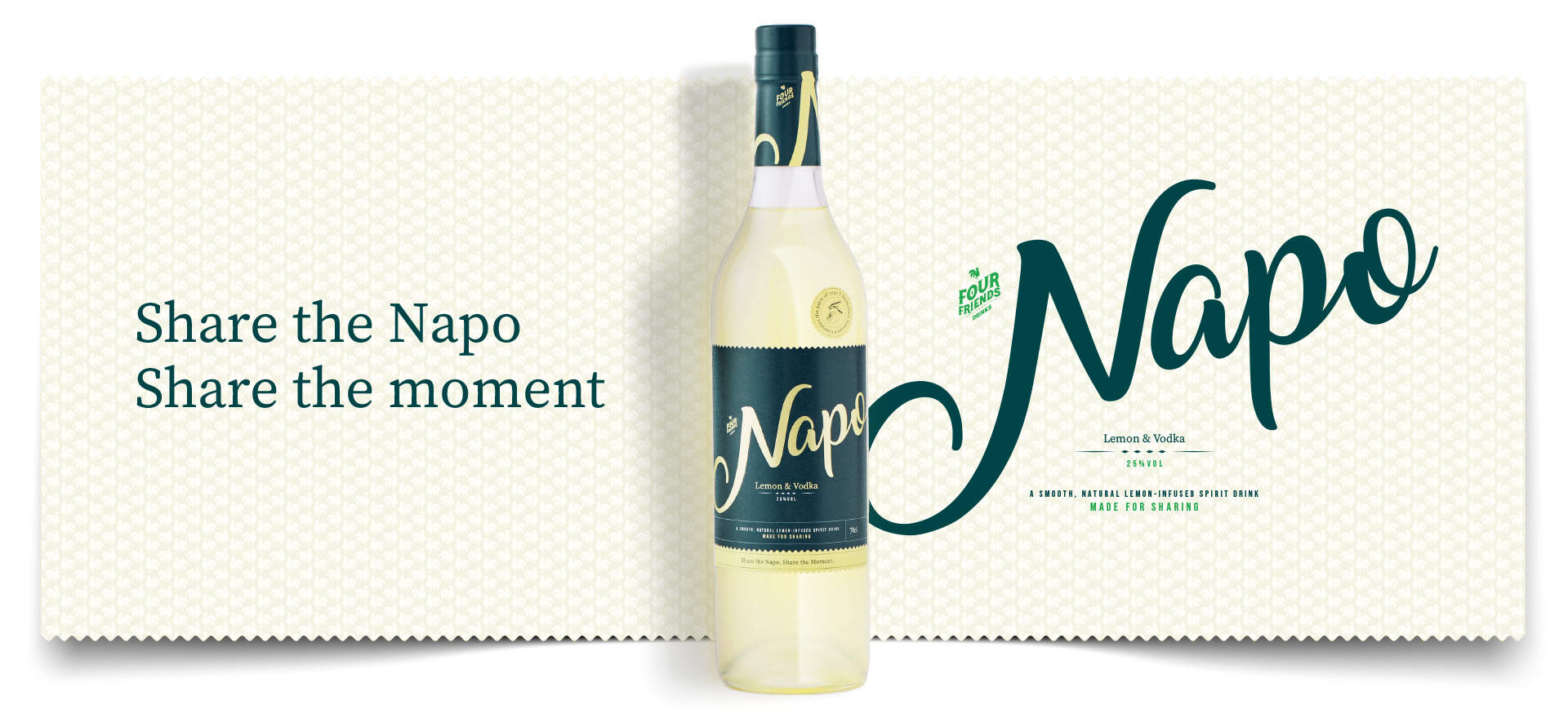
We handed out over 300 samples and heard incredible feedback on the liquid, brand, look and feel! Some sound bites were “it looks stunning” and “that bottle is so strokable” - a massive thank you for nailing the brand.
Robert Hobbs, Director of Four Friends Drinks
Conclusion
Colour’s role in packaging design goes beyond superficial appeal. It’s a strategic element capable of defining a brand’s identity and steering consumer behaviour. The fusion of scientific findings and real-world instances reinforces that colour isn’t a mere add-on; it’s a dynamic tool for capturing attention, conveying emotions, and nurturing brand loyalty. Colour’s impact on packaging design is undeniable – and essential.
If you’d like help designing your packaging, don’t hesitate to get in contact today.
We are a design agency based between Bristol and Bath, passionate about delivering meaningful & lasting results. To find out more about how to contact us, click here.
