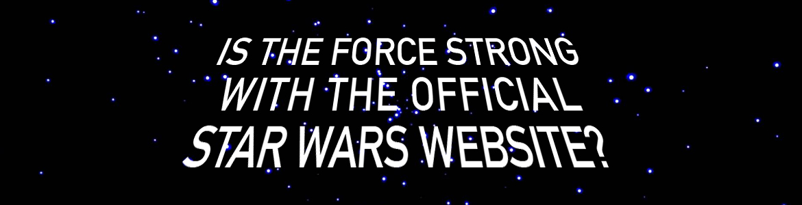
May the 4th be with you!
4th May 2016
In true fan style we thought it only right to honour one of the studio’s favourite holidays for our best of web this week, Star Wars Day.
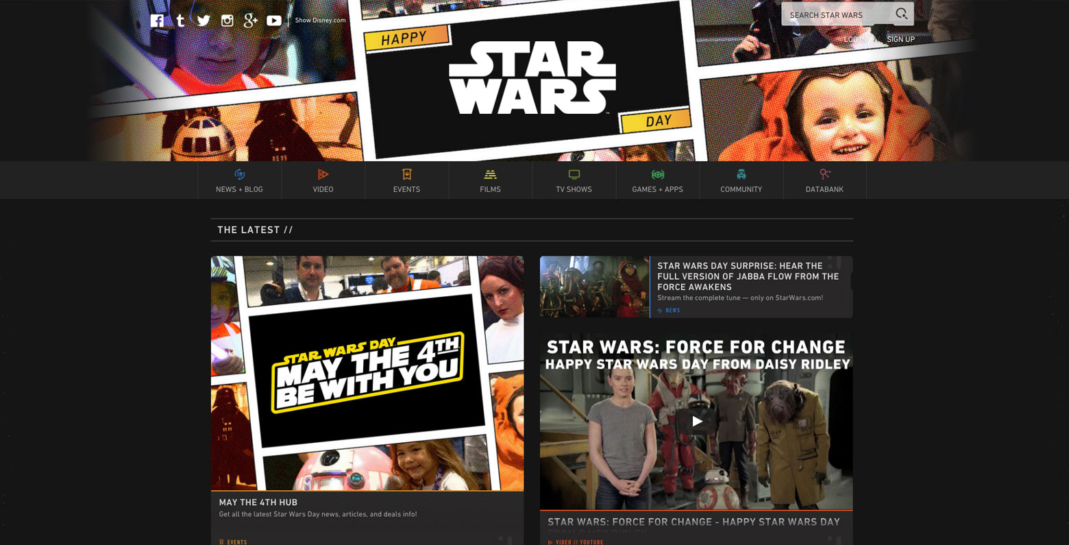
A long time ago in a galaxy far, far away…a design team endeavoured upon a journey to improving and making the force stronger with this one, the Star Wars official website.
So, as big Star Wars fans we were expecting a lot from the official site, we wanted engagement, interactivity, to be enthralled by the evocative world of Star Wars and being the day in question, our expectations were very high.
However, we feel that the site has given itself to the dark side.
BUT no fear Star Wars site, as fans, we feel it’s our duty from the design troopers before us to give our creative support, as remember, Yoda himself did say: “Do. Or do not, there is not try.” so here we go…
Click here to see the Star Wars Official site.
The dark side
1. Look and Feel
The films pave the way for how we envisaged the site, from the amazing ships, to the captivating costumes, to the vast landscapes. However none of this seems to be mirrored on the site at all. It’s very dark, almost foreboding and although imagery is used and is full screen, they confuse the header and are also lost the minute you scroll down, which makes you wonder what’s the point in the first place.
The colours of the dash seem a little sporadic and the dashboard in general could have been worked up a lot more in the sense of making it into a spaceship control panel maybe, with many controls faded in to make it feel like you were driving the site.
We were very surprised also that for such a big franchise, why they haven’t added any movement to the site? No parallax scrolling, no animations of any kind. Surely this genre begs for such an engaging and evocative platform.

2. Content and tone
The site is very dominated by Star Wars jargon which appears in endless paragraphs throughout the site. Arguably you would associate this with most fan sites with life long fan bases, however, it seems to forget about the other fan base, the kids. Being very wordy and technical will inevitably come to the kids as they get more and more into the franchise, but there needs to be more short and snappy snippets throughout the site to add a little bit of character. E.g. more character quotes spotted about, maybe a few quiz questions on odd pages just to get the kids thinking. As lets face it, this is almost a GCSE subject in today’s social world, Star Wars is bog standard case study that everyone has been touched by, so teaching kids in more engaging ways of getting them to analyse what they’ve just learnt could work well.
Visually, the content is quite small font size and clustered together. We’re great believers that if the content is good enough, you can break it apart a little and it will still stand strong, e.g. Highlighting the first paragraph in a larger font, will not only start to lift the design of the site, but also give it more breathing room and automatically look more digestible.
3. Technical
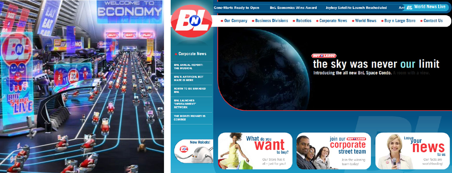
The sign up form here is one that we pulled out, not from a tech pov but more of a lack of information about what you get when you sign up? No intro paragraph whatsoever. As fans, we want to be wowed about what we’re getting, not left with guesswork. The lack of movement on the site is also criminal, it’s crying out for an overhaul in terms of subtle animations, pulsing as you hover etc or brought into the site more by giving it a theme. Wall-e did it brilliantly when they launched the film, creating a ‘Buy N Large’ (the main franchise in the film that made the people obese by selling lots of food products and the lazy lifestyle). The site literally made this franchise into a real thing, it’s own interface etc. And with so many worlds to choose from in Star Wars, they could have created a different feel every time the user logged into a different session, one planet today and another tomorrow.
4. Jedi’s?
The kids as an audience, needs more thought throughout the whole site, which means rethinking the current strategy from informative to engagement, making the site THE hub of activity rather than reporting about it. It almost feels like a news feed currently. But by giving the site it’s own narrative and purpose from both angles, will help please all audiences. Maybe creating a kid zone would help, or a Jedi zone, whether the homepage stays the same but the design is somewhat different, but more interface driven than informative. Let the kids pick a character as they enter the site, no purpose apart from a bit of fun, where their interface changes dependent on who they’ve picked. Whether this changes in colour or in tone, e.g. Darth Vader may have a hidden hotspot that once found reveals a secret plot on the site, or he has slight overlays of the “light side” stories on the feed with judgemental remarks that only our Darth would say.
5. What ideas we would add into the mix
In general we’d have a look at making the whole site more of an experience by adding different features in:
- Design a split splash screen, where you select the light side or the dark side, then dependent on which you chose changes and dictates the interface of your session
- Yoda Facebook Status generator – where you can put a sentence or phrase in and it automatically makes it into a Yoda phrase for you to copy and paste on to your status.
- Top trumps character selection – Play as one of the characters and fight against your friends by sharing results on social media
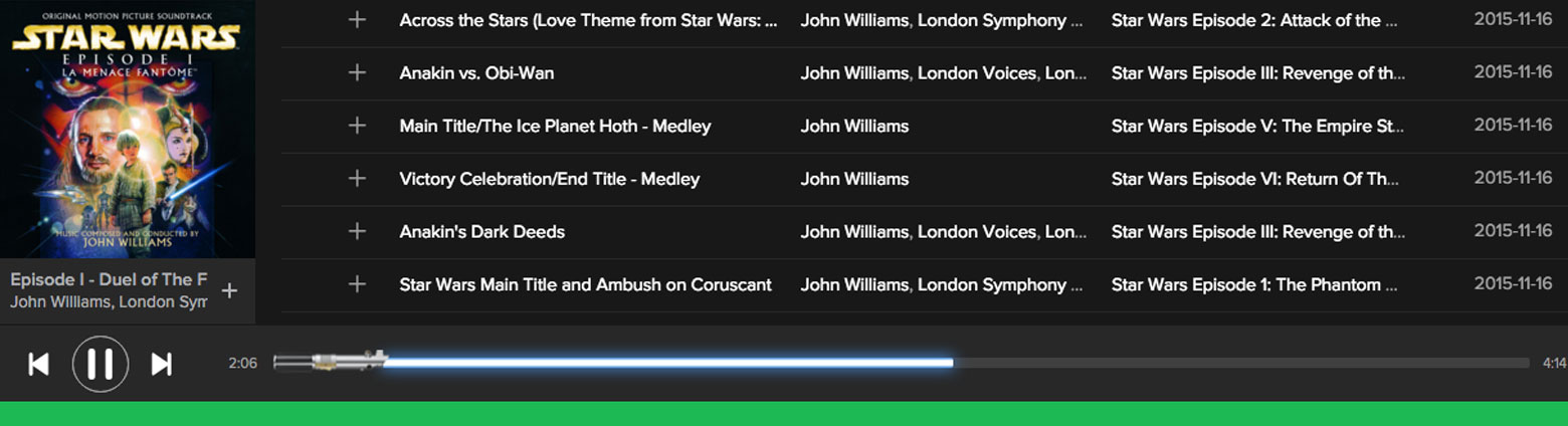
On a side note, Spotify celebrated the holy holiday with a fab bit of interface design, just for today. Changing the timer scrubber to a light saber, so you drew the saber as the song played. Really subtle, but sooo effective. Showing that not everything has to be theatrical or informative, but that sometimes the little details can be the most effective.
The light side
On each visit to the site, it’s almost overwhelming but in a highly excitable fan manner, with the vast amount of content and feeds, it’s such a good job of collating all this information together in one place. And we do appreciate that the Star Wars site is a major databank and maintaining all of that information in a constant and consistent manner must be a full time job for a big team of designers and developers. As well as keeping it up to date constantly must be a battle. The vast amount of data and further reading on the site is astronomical and so impressive, we just get excited as designers to want to make more of such an amazing worldwide franchise. The content and site works extremely well as an information hub, and as huge fans would just like to make more of this lush content by pulling bits out and making more of it in a visually exciting manner.
