
Rebrands – the good, the bad and the ugly
14th July 2016
There comes a time for every brand when their identity needs a refresh. Whether this be their target audience identity, the technology they use or the logo itself, the decision to rebrand a company’s identity can be not only tricky but if not done well, detrimental to the brand’s reputation and followers. Audiences can also be highly critical of a change in their chosen brands, which doesn’t necessarily mean just the design of a new logo; but also radiate out into the brand’s core values and attributes, that make it sought after over other companies, such as trust, reliability and innovation. For this reason and because design is such a changeable and personal thing, everyone has an opinion, we put it to you to make up your own mind and so reveal our top 6 rebrands.
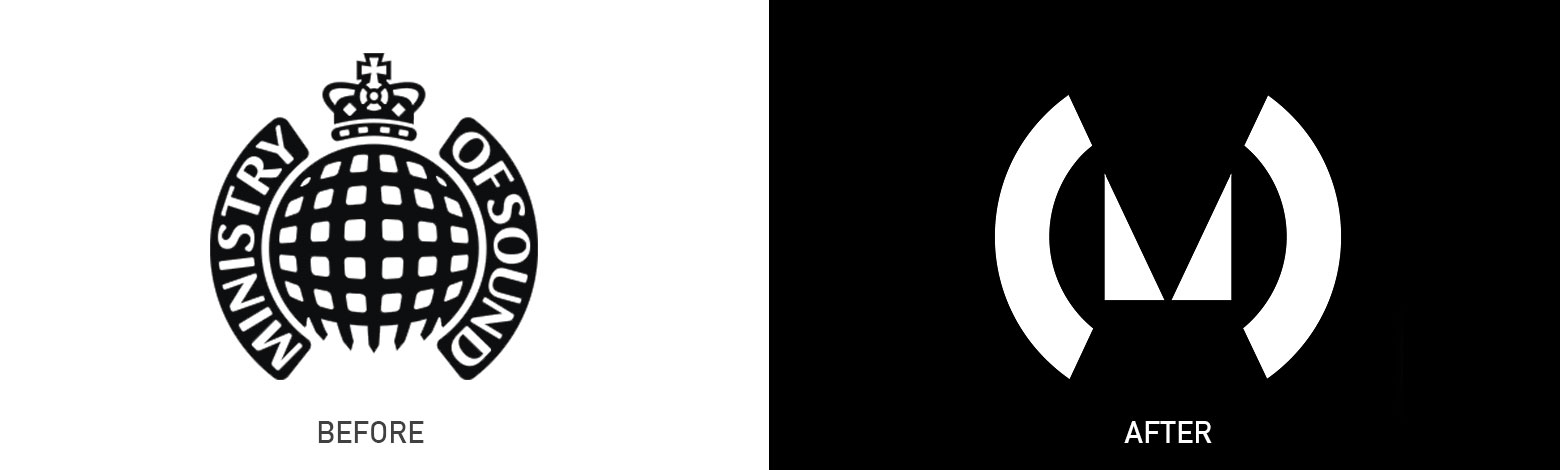 1. Ministry of Sound
Probably one of the most iconic brands of today, the domed gates and the crown up front and centre. However the design studio, Spin, have stripped these qualities right back, simplifying the identity, creating breathing room, taking away the name as the brand is already established so doesn’t really need the name. However, there’s still something about the old identity that we miss, maybe its the change to minimalism or the subtraction of the name, an element just doesn’t sit right with the new identity to us. What do you think?
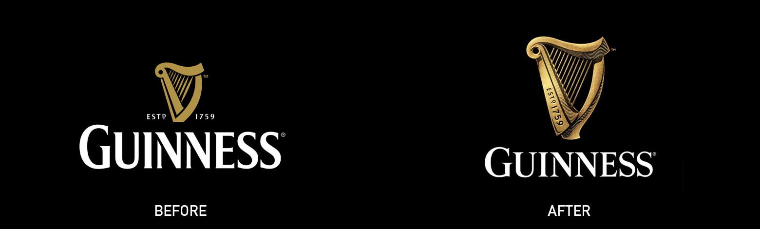 2. Guinness
A globally recognised brand has had a subtle facelift recently, what’s not to like? The long running company has added detail to the iconic harp to add a little more realism to their modern minimal take on the nostalgic brand. This adds a little generational feel that only embellishes the brand’s long life. Subtle but very well done.
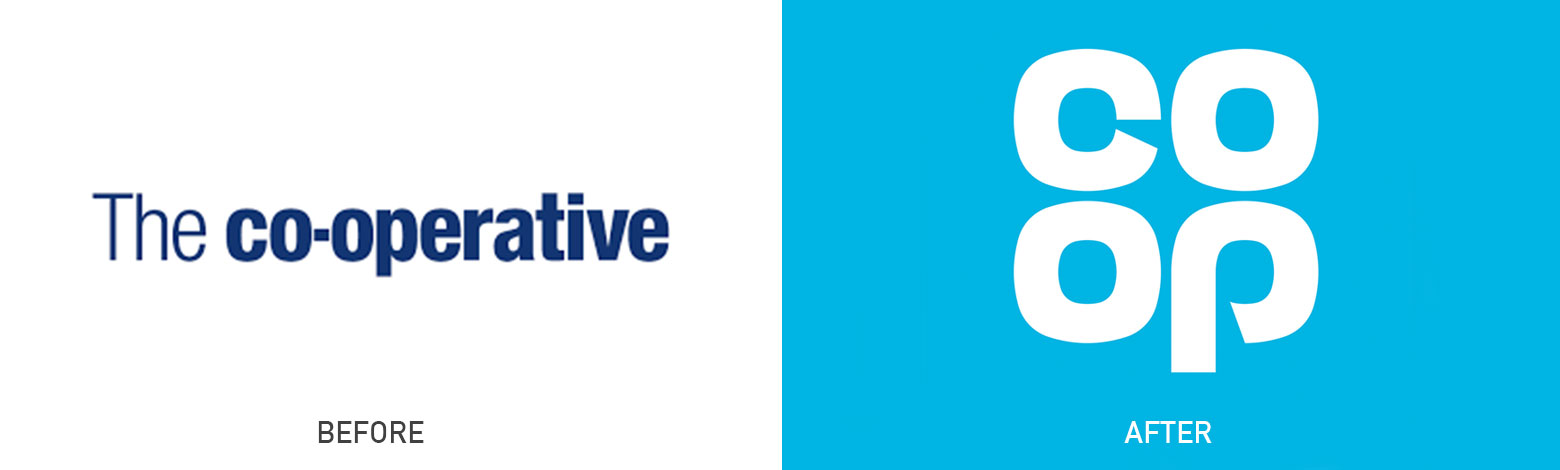
3. Co op
Co op have taken inspiration from their heritage and have gone back to their old logo design in most. Although their old identity is very symbolic, we can’t help but think it’s a slightly easy option and wonder what will happen with the current brand’s colour palettes of each division, such as their funeral care (purple) and travel agencies (orange). However, the cyan blue shade, square / app feel makes it stand out amongst a sea of quite similar supermarkets, so maybe taking inspiration from the past does work? What do you think?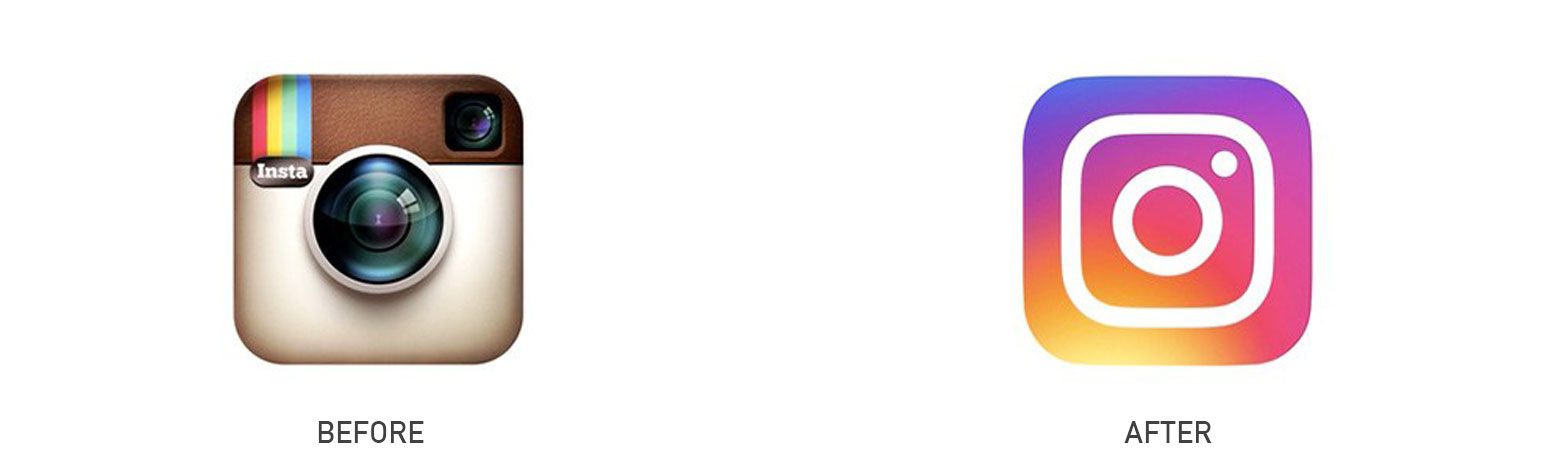 4. Instagram
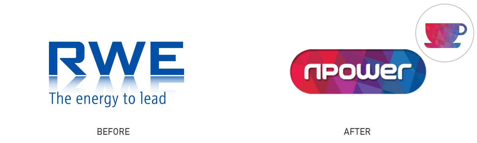
A controversial rebrand amongst creatives with very mixed opinions. Trading in their detailed camera approach for a more visual colour palette amongst simple icon attributes. The brand is quite similar to the RWE to npower rebrand a few years ago, where they traded their basic logo in for an isometric colour palette that they used as a backing sheet for all their icons.
 The new palette gives the brand character and more flexibility through the rest of their branding and also stands out more on devices.
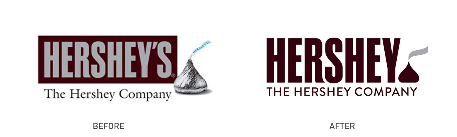 5. Hershey’s
From good to bad. One of the biggest chocolate names in America, trading in photography in their identity for an icon which normally would be a huge asset and very now. However, we all wonder what their thinking was behind this icon and its close resemblence to the facebook emoticon poop. Hershey’s anyone? One block or two?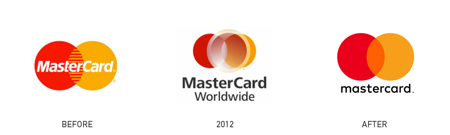 6. Mastercard
And finally to dam right ugly with a little bit of hope literally over the past few days. We have no idea the thinking behind this one and feel like we have got the two logos the wrong way round surely, but no, this is the 2012 Mastercard logo. Apart from it being incredibly, lets say nostalgic, with it’s faded out grads, the third circle (which we’re unsure of its purpose) isn’t even central.
However there is a light at the end of the tunnel folks, as of July 14th 2016, Mastercard have launched their new identity. A very simplistic mark, using the two iconic circles overlaid and multiplied to create a third colour which could symbolise the interlocking between the two circles in the previous ident.
So how do you know when to rebrand?
A hard question as again this is a very personal thing. A brand is an extension of yourself and just like you have a personality, so does your brand. You’ll be critiqued by how you come across, how you communicate with audiences and how you look which is where the rebrand comes in. Rebranding is always going to be a game of poker, you have to trust your instinct with a bit of theory and strategy (marketing nouse) and go for it. Some brands decide to do a slow cross over, where they maintain their old brand mark, but also reveal their new identity alongside for a period of time, which shows consumers the progression so you don’t create a shock confusion by a sudden change over. Other brands create campaigns and brand launches a few weeks before, to prepare their audiences for the change over. It all depends on the marketing plans and strategy that each brand has in place to how they rebrand their company.
To rebrand, a company needs to look to its competitors and research into their ever changing target audience. And of course analyse their finances, as rebrands can be costly, having to update all print collateral, launch collateral, website updates, automatic email designs, signatures, all takes times which will incur yet more costs. But if the rebrand is a really strong one, then all this will be absorbed, in generating a clearer but relatable identity that will inevitably attract and maintain customers.
