
Using website animation to enhance your brand
15th September 2016
Web design is continuously changing and as more and more devices become available, we are continually trying to keep up to date with the latest trends to engage our users. And we all have our own preferences when it comes to how we like our websites to look and feel, but over the last 10 years, web design has crossed over into the UI world, becoming more theatrical and we’re seeing sites as experiences opposed to just information communicators. From parallax scrolling that make our photography more dimensional to subtly moving pages that create a story through the user’s scrolls, website animation has definitely been on the rise and become an integral must in website structure today. But is this animation encouraging our users to our sites or restricting information engagement?
What is website animation?
A general umbrella term for website animation is a web first technology that can consist of CSS, javascript and HTML. These technologies are then used to animate objects and functions on our websites.
Should animation be used today?
As with all design and development overdosing on a certain style can have negative implications, which is why we always promote the white space ratio as a rule of thumb. But there’s no reason that animation shouldn’t be used, it adds to our users experience and can sometimes even improve it, we just have to consider a few general rules before going full speed ahead.
Does the animation reduce the usability?
This is one of the continual questions we always ask ourselves here at Bopgun throughout the whole design process. The user is king, we want to make their journey as easy as possible, so consideration needs to be taken in how the animation will engage with the user, what is it’s purpose? Not to distract from the main intention of the animated object. Such as a CTA, if we animate this, it’s purpose is clear, we want people to subscribe or sign up, but being careful with how extreme you go with an animation also needs to be thought about, subtly is often a good formula to follow, but remembering to revaluate our websites continually with this question will ensure we don’t annoy our users.
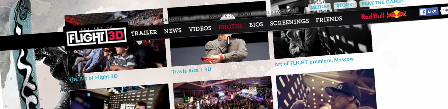 The Art of Flight 3D – The idea here is great that it’s all about snow boarding with the jumping and height conveyed in the scrolling. However, it doesn’t seem to come across very well in the final solution. The scrolling is a little messy and disorientating. There isn’t an end point and it’s hard to see where you are in the journey. This is a classic example of how animation seems like a fab idea but in practise doesn’t quite translate and almost detracts from the user experience.
Will the animation require extra resource?
Time is the hardest thing for our users to depart with, as in such a fast paced world, plainly we don’t have any, so we need to watch our page loading times. We are all used to quick internet and we’ve come to expect it as a generic formula to a site now and when we see something that doesn’t load as fast, it sticks out like a sore thumb. It is said that you have a total of 10 seconds to capture your audience on a website. After that you have lost your user, potentially forever. So reducing time is a massive asset to a website. Animation can use extra code and graphics, so we need to remember the user throughout this selection and consider how inflictive it will be on patience.
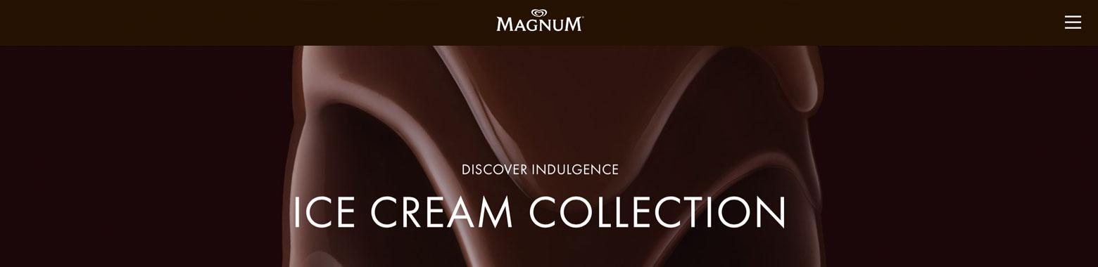 Magnum – A great example of really subtle animation and build up of elements opposed to flat designs.
Does the animation engage in a functional or experience manner?
Some of the most successfully animated sites have got to be when a brand has invested time in using animation that actually improves certain functional aspects of a user’s journey. When an e-commerce site adds an item to your basket and then a checkout button animates in or bounces, this is subtly clever, as you are predicting where the user’s journey will eventuate next and giving them the breadcrumb. The same with planning out where a user may get stuck on a page, animation is a brilliant device in bringing the user back on to the trail. Of course, creatively beautiful animations are also a great way and being remembered as a brand, however keeping in mind not to deviate too far from the journey and generic positioning the user expects.
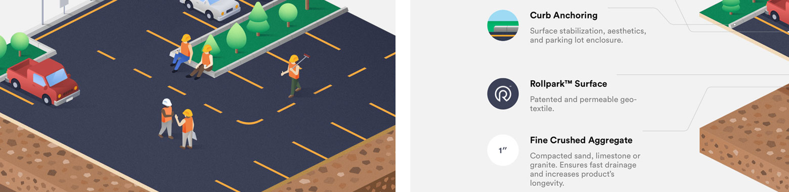 Rollpark – A great way of showing a complex diagram in an interactive, animated and user driven manner that adds to the experience.
Can we create the animation using modern programming?
Think about your user’s interface. If your audience doesn’t support a certain animation type then it’s as bad an impact as when you see a site or email design that have missing images. Flash is a great example here, most modern browsers don’t support flash sites much anymore, so is this really a good program choice? Think about the tools you have access to equally as you do your users.
3 Types of animation
In animation there are many ways that we can improve a user’s journey creatively and functionally and generally speaking these fall into 3 main categories:
1. Interface element
This can be anything that enhances the interface and make it easier to use. Such as an animated call to action, navigational element such as the menu icon to contact forms and light boxes. This type of animation doesn’t change the journey but looks for the opportunities that surrounds it, such as graphics on the page and how to create engagement.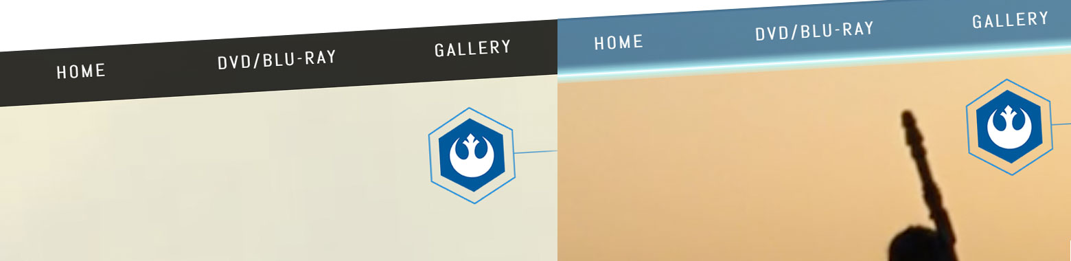 Star Wars – The Star Wars sites does this well. You pick the character side and then the user interface changes colour. Really simple and effective.
2. Story telling
Probably one of the most popular animation styles, where the page becomes 3 dimensional, building up bit by bit opposed to loading everything as you enter the page. The user also controls the building as they scroll down. This type of animation requires full user interaction. This also puts the power in our hands, controlling our experience so no company giant dictates our journey, they choose to scroll or not, which can in turn enhance a brand’s reputation.
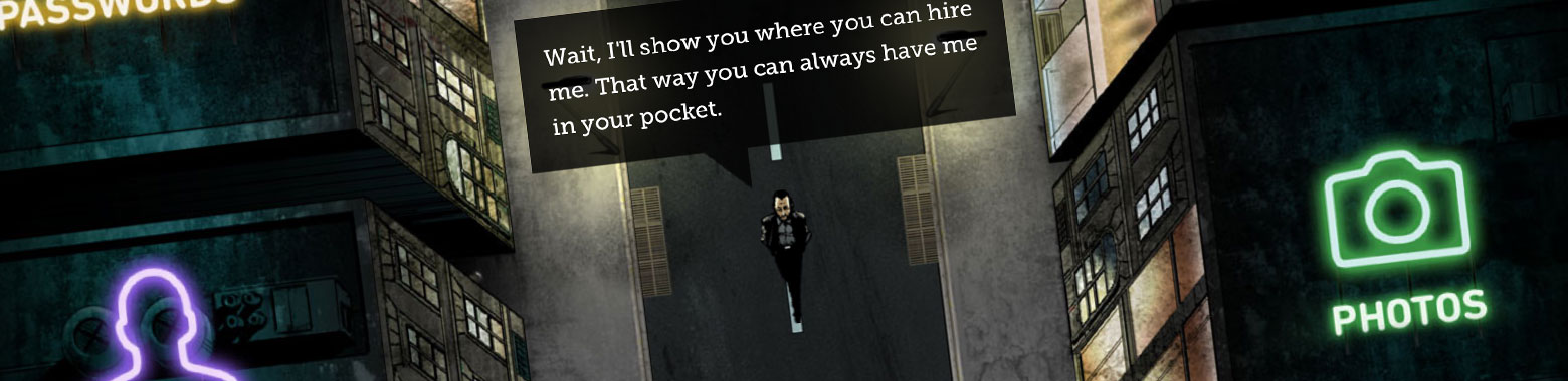 Ben the Bodyguard – A clever idea of again letting the user tell the story themselves via scrolling and building up the information through a series of speech bubbles.
3. Preloaders
This is yet another beautiful way of retaining user engagement, whilst the site loads in the background. A sort of distraction technique. We all like to know a start and end point, so site’s that use the percentage progress bars are understandably quite successful as we know how far we are in the process. But website animation has now pushed this one step further and decided to utilise these few seconds as an extension to the website experience, by animating subtle background’s and brief animated cartoons to watch as you wait. Some sites even use this loading screen to incorporate a small game to play while you’re waiting. It’s a clever way of managing the time and patience issue on a site, distracting the user enough so they don’t even notice the time spent on the page.
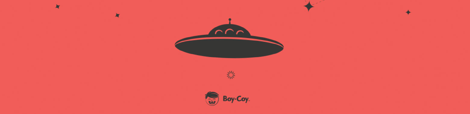
Boy Coy – Although the rest of the site is disorientating and uses a little too much parallax and layered animation, the preloader is a very subtle example of how to add a little bit of movement as the user waits.
Summary
All in all website animation is another great way to improve usability and to be remembered as a brand creatively by pushing the essentially 2D screen into 3D by making it an interactive experience that the user will appreciate. And again as with everything we do, as long as we don’t overdo it, it can massively enhance a website’s creative and effectively retain and encourage consumers. Making us into digital set designers, by thinking outside of the 2D box and creating the scene for the user.
