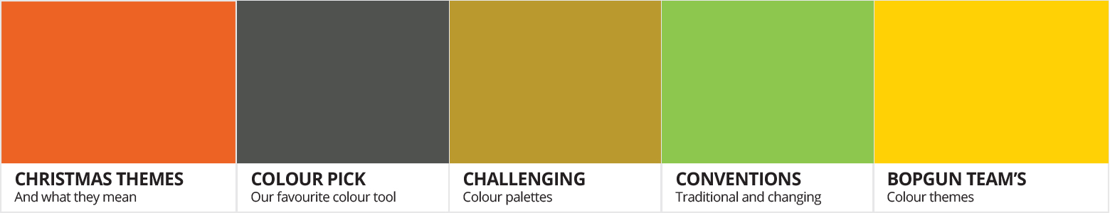
Challenging colour palettes
8th December 2016
This time of year our eyes are invaded by numerous colours and themes, from the traditional green Christmas tree, to sparkling tinsel and twinkling lights, we are constantly surrounded by the season, indulging ourselves in the Christmas spirit. And with the Winter nights closing in, it’s easy to see why so many adopt this importance on colour and theme with their decs as a sort of substitute for the lack of sunlight hours in the day. But just like the array of Christmas songs out there, we all have our own opinion on what theme truly means Christmas to us. Whether you go for the John Lewis woodland feel with natural shades or the traditional red and green with chunky garlands, we all seem to adopt a certain style for our holiday; and although companies bombard the shelves and media each year with new colour schemes and trends we still seem to keep with tradition. But where did these themes originate? Why do we go back to the same colour themes each year?
All I want for Christmas is the right hue
Lets explore some of the more popular festive colour palettes that are truly symbols of most of our Christmas themes:
Traditional – Red and green

Probably one of the most popular of all colour palettes, the traditional combination uses strong reds of poinsettias and green of chunky garlands and the tree to accomplish this required palette. Big red bows are also a favourite, the bigger the better.
Symbolises:
Red robes of the bishops and saints, hence St.Nicholas wearing red. The red berries of the holly, symbolising the blood of Jesus and green leaves of the holly and Christmas Trees. Traditionally, both colours depict the apples from the Paradise tree in the Garden of Eden that lead to Adam’s demise.
Winter Wonderland – White

Inspired by such films as the Narnia films, this icy wonderland colour theme encompasses crisp white tinsels, white light and snowflake decor, making it a minimal contemporary canvas for those that detest Crimbo clutter but want to retain the Christmas magic.
Symbolises:
Purity and peace to all men as well as the snow of the season. White wafers were originally used to decorate the Paradise tree which represents the bread eaten during Christian Communion.
Warming glow – Red and gold

Homely and warms the cockles of your heart, a great theme to make visitors feel welcome. With a slant of red to cut through the royal golds, this Aztec winter warmer palette is sure to keep your family and guests royally cosy.
Symbolises:
Gold is the colour of giving and the red symbolises the holly berries, symbolising the blood of Jesus. Add green to this duo and it becomes a symbol of the three teachings of Jesus Christ.
Frozen – Blues, whites and silvers
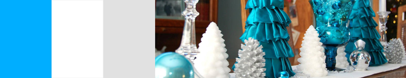
Made popular by the Disney epic ‘Frozen,’ this glistening scheme is a cool palette for those that want their Christmas to continue the outside elements indoors. With sparkles and icy blues, it’s easy to see why kids love this grotto, north pole theme.
Symbolises:
Silver was the symbol of giving just like gold, whereas blue had multiple connotations. Mary was often depicted wearing blue, which not only symbolises Heaven and the sky but was also a royal colour as the dye to accomplish the colour was more expensive than gold. Using blue for Mary symbolised her royal importance.
Bling – Silvers and sparkles
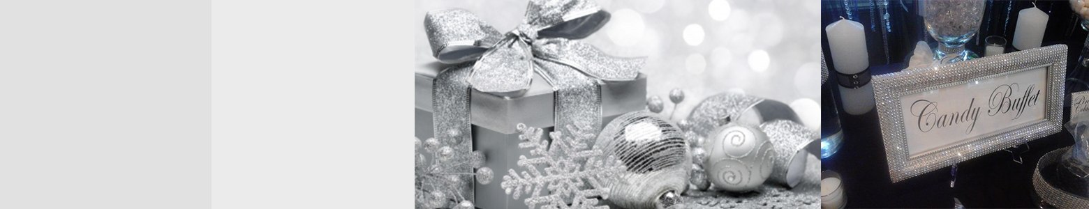
For the more glamourous tastes, this is also another popular choice, perfect and sophisticated for both Christmas and New Year parties. Each surface glistens and shines with dainty crystals, mirrors and lights that sparkle, making this theme a versatile popular choice amongst party hosts.
Symbolises:
Silver was the colour of giving and generosity.
Woodland Wonder – All Natural
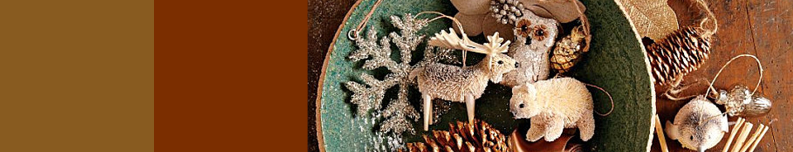
The rustic, all natural theme, again another palette that likens the outdoors, indoors, but from a more woody, creature angle. Crimbo animals, pinecones and stick decor is a likely theme in this chosen scheme.
Symbolises:
Brown may not seem a theme associated much with Christmas but in fact we can see it in the Christian holiday story in the colour of the manger, the donkey that carried Mary and in the shepherd’s clothes. Although not front and centre, the colour was just as important.
Royal and Regal – Purple and gold

Royally for the more garish of tastes, this palette sees the use of regal purple offset with gold sparkles and shines that make guests feel spoilt. Expect satin and sparkly fabrics, offset with gold cutlery and gold rimmed glasses with this theme.
Symbolises:
A very regal colour, purple and the giving colour of gold combination is often used to depict royalty and importance and in the Christian story, depicted the welcome to the coming of the king.
Colour like no other – Multi colour
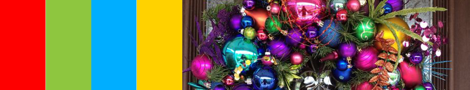
A favourite amongst kids, the lights, the tinsel and even the use of outdoor lights are colour a plenty, making this one of the easier themes to create at home.
Symbolises:
There’s no direct symbolism in using multi colours but a combination of all these colours meanings can be taken from this colour scheme.
This year’s Christmas colour pick

It may sound obvious, but the in colour theme for 2016 is shaping up to be the ‘All white’ approach. White furniture, white decor and crisp linens for the Crimbo table. Just proves that white space can be a timeless favourite.
Which theme do you fall into it?
Top colour pick
Stuck for a Christmas colour theme this year? Don’t want to conform but instead start a trend?
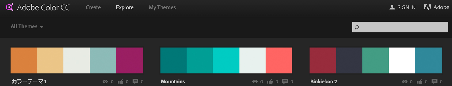
There’s constantly sites being developed to aid designers in numerous day to day struggles, from font decisions to images, but a colour theme can be one of the hardest things to get right for a client, especially in rebrand stage. One of our top sites, which we’ve mentioned before is Adobe Color CC. Not only can you input a starting colour and ask it to help with complimentary shades, but it has a great feature that anyone can use and upload to and share with the rest of the world and that’s Adobe’s ‘Explore’ themes feature. This enables you to explore the many palettes that other designers have put together but also allowing them to be downloaded and implemented throughout all Adobe software. This is a great tool to see what others are doing with colour, great for inspiration and fab platform to explore and challenge new palettes. Check it out.
Changing convention
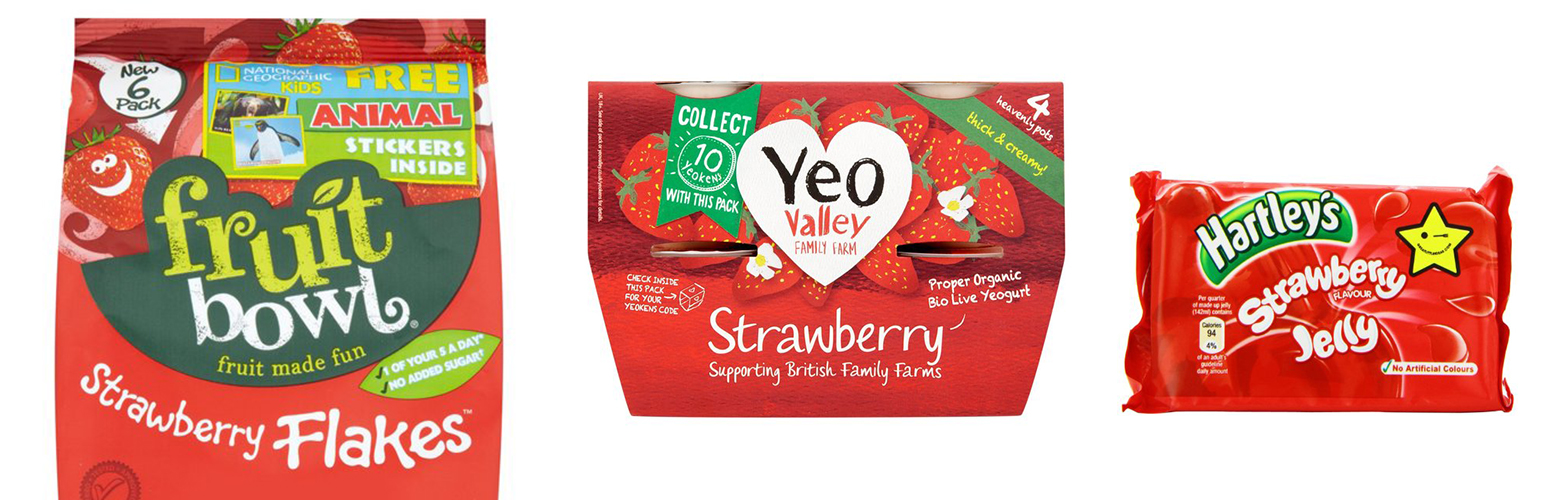
However, it’s not just Christmas where certain generic themes are adopted, we can find it in our everyday products and services too. Lets look at flavour for instance. If we said Strawberry to you, what colours would you think of?
What about Cheese and Onion flavour?
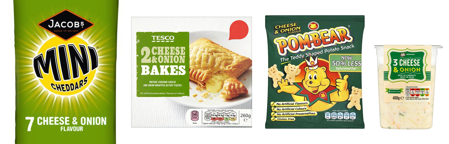
Why do we associate these colours with these flavours? Cheese is ultimately yellow and onion a mixture of white, green and brown, so where does the overall green shade come from? Why have brands adopted this palette for this flavour? And why not change it? Generally it’s down to expectation, we have had so much experience of these products that we now automatically associate these flavours with these colours, which adds another sensory tactic to the buying journey, as we don’t even need to see the flavour in words to know what we’re buying.
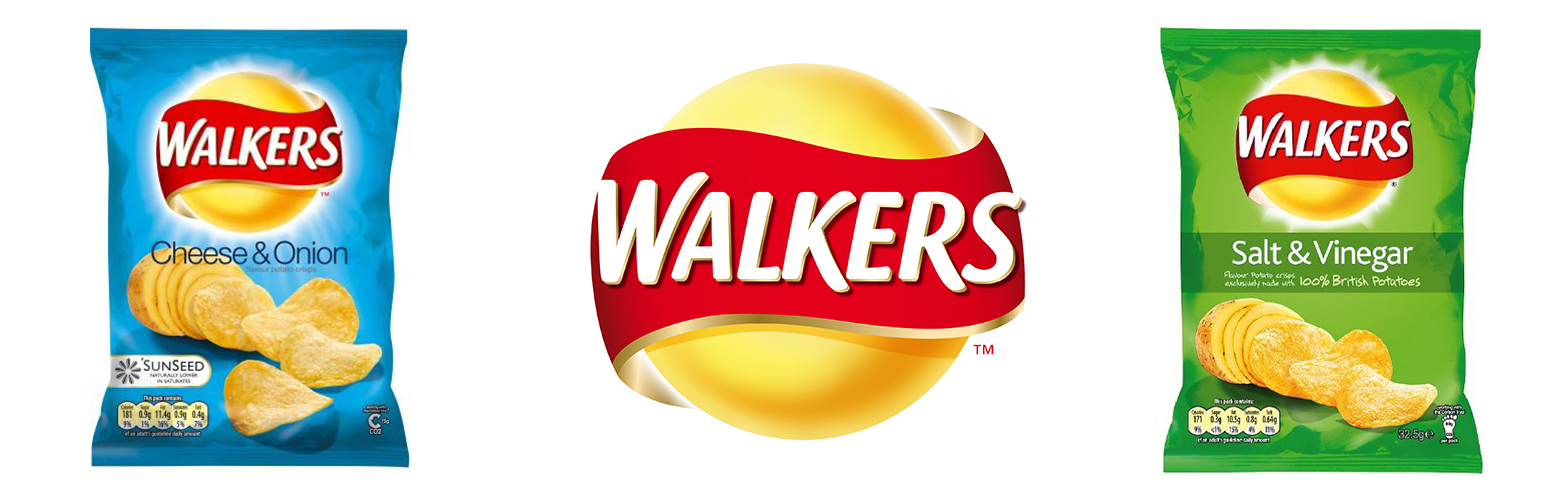
However, certain brands are starting to break these conventions slowly and surely, one very well known brand in particular, Walkers. Many years ago they were one of the first giants to venture outside of the stereotyped flavours and make their ‘Cheese and Onion’ flavour blue and their ‘Salt and Vinegar’ green across all their ranges. Why did they decide to do this? Plainly because they could. They are so well established and have such a following, that the giant is in one of the best positions to play with their brand and why not?
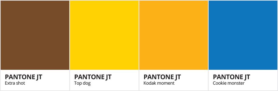
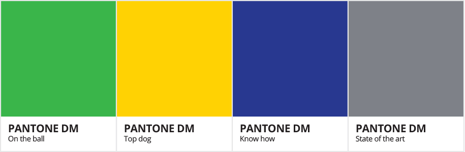
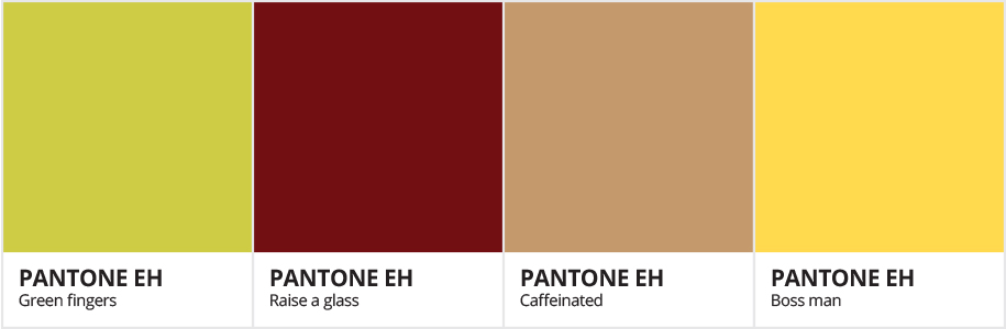
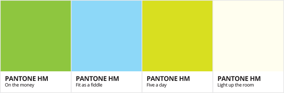
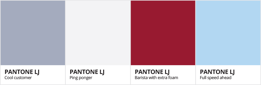
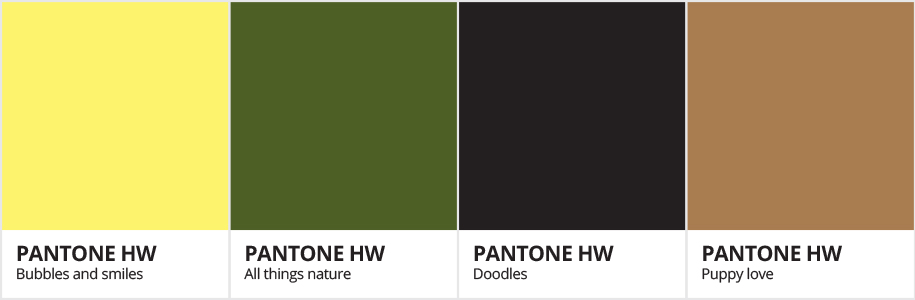
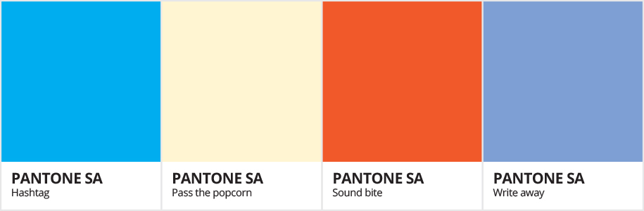
The Team’s Themes
Thinking about how to push colour themes and challenging tradition with innovation, we’ve put together some personal palettes that best relays each of our team’s features, strengths and personalities through the use of colour. Checkout our team’s themes below.