
Creating visually engaging client data
16th February 2017
Feedback has always been an important piece to every brand’s action plan, completing the user’s request for validation from their peers. The information and data collected is essential in maintaining and even developing a brand to keep up to date with technology advances and audience, society changes, making data a central and integral element to a brand’s mission. However, it’s not just the consumers who need validation. Share holders and boards of directors and investors are always requesting updates of how their brand is doing. The data they seek generally fits within the financial realms, which can be somewhat hard to visualise in an engaging manner and although these investors are after the figures, they are still part of society that needs to be visually engaged when it comes to data and information and are expecting it.
As brands continually are being split between shares and ever changing investors, this type of design has become a popular request amongst clients needing to prove the success of their businesses. And through presentations and stats sheets we are finding that this is an almost bread and butter base to most client plans. As designers, it’s our duty to keep up to date with how to share this information in the most creative but concise way possible. A somewhat hard task, to make something creative but stat driven, almost a contradiction you may think, but still a necessity that we need to adapt to creating, but how do we go about this?
What is Data Visualisation?
This refers to creating data in a visually appealing manner such as an infographic or pie chart that will help understanding of the stats to your prospective audience.
Top 8 ways
We’ve pulled out our top 8 ways to make these stats and data visually exciting, from the brands who are doing it right, to the software we use to create it.
1. Consistency
Obvious you would think, but probably one of the most important components in creating complex content and ensuring you keep your audience’s attention. Set your heading, body copy, colour palettes and styles and then keep them the same throughout your document to ensure you don’t confuse your user.
2. Infographics
Infographics have always been a great way to show data in a visually communicating manner. Creating a world for stats to live that creates intrigue. And we see so many of these that although they may take some time to create, we expect them, just like our pie charts and graphs, which makes it an effective and appreciative method for our users.
3. Baiting paragraph
A great way to pull out important information and break it up is to have a highlight paragraph. Magazines often do this by using ‘pull quotes’ where they select a sexy bait paragraph to draw the user into reading the article. By simply selecting an interesting piece of text and enlarging it can grab a user’s attention.
Natwest do this well. Having recently rebranded to their isometric style, the bank often has complex content about mortgages and shares that need simplifying. The bank’s rebrand has given them a gorgeous old school isometric font which they use to highlight important information in their collateral to draw the user’s eye.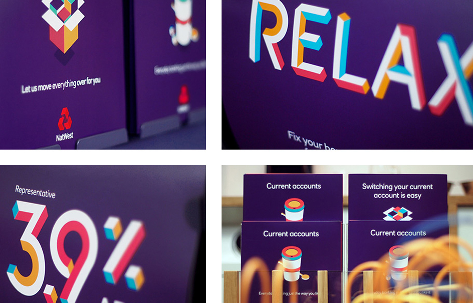
And with their isometric typography also expanding into the graphical world, we can see that they are masters of visualising their stats too, retaining consumers from their graphical intrigue and attention.
4. Scroll feature
Looking more closely into how we use technology for a moment, the scroll feature is a common favourite that we are very used to. So why not incorporate this into our data design? Create a long infographic for instance that the user has to scroll down to read. The data is then controlled by the user as they scroll, it’s a great way of compressing content into a smaller area and looks less intimidating when it’s in one graphic than having say 20 slides to read. It also gives us as designers a great platform to think outside the box a little, for example, you’re a construction company, why not display your investor data on a scaffolding tall building infographic, giving the content context and making it more visually exciting. Here’s a great scrolling example of getting data across using this feature but at the same time giving the graphic context.
5. Style your data
Dependent on your client and data, styling your content is another lovely way of making yours stand out. Theming your information to a certain relevant context can help not only create intrigue but keep your user reading. E.g. We did a post a few months ago for the Supermoon, which there is endless information on numerous sites. So to compress it and link in with the “superhero nature” that it sounded like, decided to create it as a comic strip, breaking the information up into a few selective sections. However, it could be absolutely anything, but if we do theme it and give it context it’s more likely to be memorable.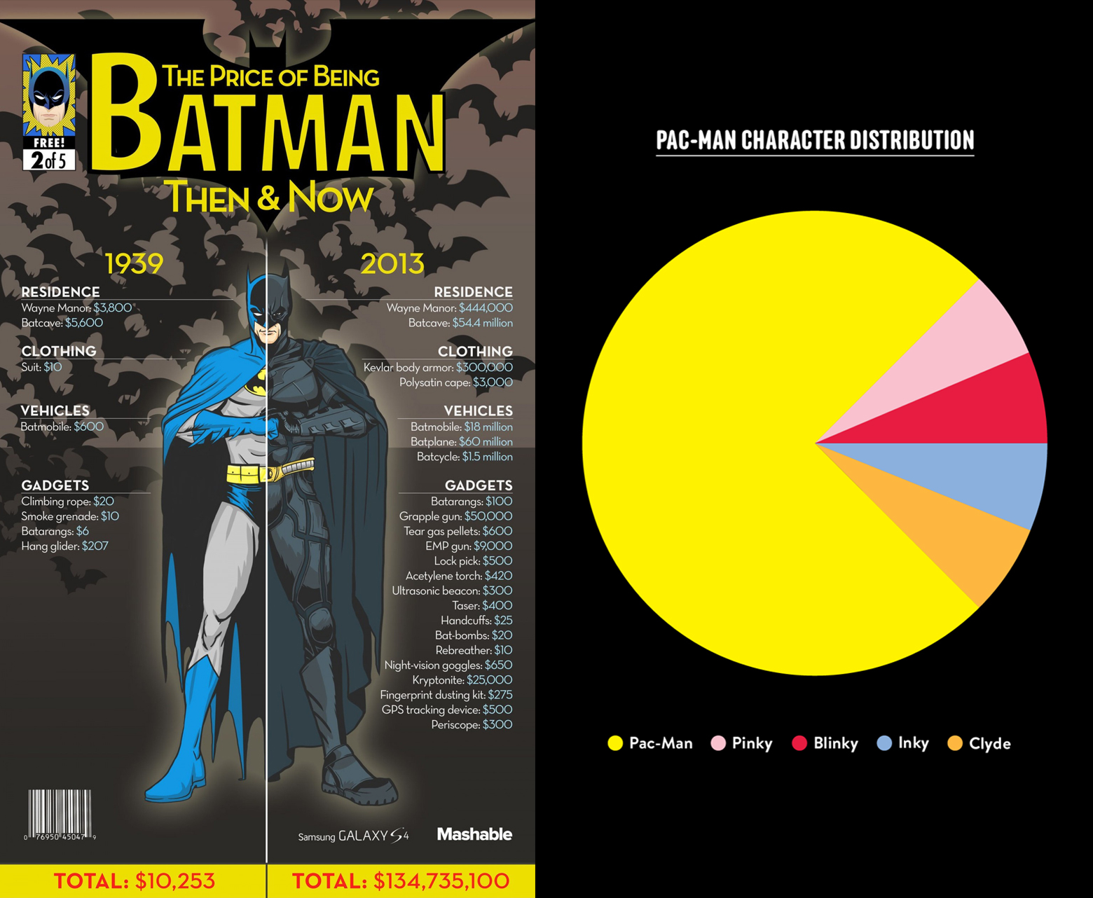
 6. Editable data

One of our most popular sites we look to when it comes to data, especially when we hear the words, ‘can you make it editable for us to change?’ is Google. Everyone is familiar with it, can access it and more often than not will have an account, which makes this an obvious choice when it comes to editable data creation. But why use Google when we and our clients have the likes of Microsoft Office? The problems with such programmes is that it depends on what system your client is accessing it from. Mac and PC versions can be very different in areas and problems such as positioning of elements, fonts and updates can be an ongoing issue. However, Google a few years ago made their own similar suite of Microsoft office programmes that anyone can access from anywhere in the world. Google Docs – Microsoft Word, Google Sheets – Microsoft Sheets, Google Slides – Microsoft Powerpoint. All programmes work very similarly to Microsoft Office but are all held online. The beauty of this is that we are all using the most up to date programme and it’s held online, meaning you can access them from anywhere in the world. The fonts are google fonts, so no font issues occur, but the main positive is that no matter what machine you look at it from it’s consistent, all elements stay where they are. This makes it editable by all, but can be locked down if need be and can be shared with anyone at the addition of an email address to the document, which obliterates having to email big file sized docs, as it’s kept online and shared online.
7. Screenshots and video
A great way to add some validation to your information, showing live review feeds or desktop to responsive design differences and stats, but how you display these screenshots are just as important. Try using the device mockups to break up your factual stats such as iMac or iPhone mockups to display your screenshots on.
Video is another great way of connecting with your audience as after all, we’re a nation of youtube veterans, used to clicking on tutorials and Facebook videos everyday, so we’re already used to and have more time to watch than read. This also is a great way of compressing your information into a smaller area and in disguising your lengthy stats into one nicely compressed medium.
8. Animation
Animation of course needs to be carefully considered, as you don’t want to delay the user getting the information they’ve come for by making them wait a minute into your animation. But when it is used, whether on infographics or stats itself, it can be a great way to spruce up heavy issues and content to make it more user friendly. For example, do you have many yearly stats to get across to your client? Then why not create an animated graph, interactive or just simply as an animated gif that changes between the years so that the user can see the peaks and troughs of each year. This is a great way of getting the figures across quickly and allows the user to visually see a difference in the stats quicker than just listing them. We’ve referenced this site species-in-pieces before, but this is a great way to create awareness of such an important issue, at the same time as making something beautifully interactive and an art form in itself. It also compresses all the content into a small area and communicates a complex but very real issue. Beautiful.
