How heatmaps can help improve your website conversions
23rd January 2020
What are Heatmaps?
Heatmaps can help you to understand how your people are using and interacting on your website to ultimately improve and therefore increase your conversions. Right now do you know what users are clicking on? What they are ignoring? And if they are encountering any issues you don’t yet know about?
By using heatmaps you can find the answers to these questions and more. Even better, you can use the insights gained to improve your customer experience!
A heatmap is a visual representation of behavioural data. It lets you know how people engage with a specific page on your site. What that click on, how far they scroll and what other actions they take. There are a variety of different heatmap options to uncover any usability issues.
What are the different types of Heatmaps?
Click and Tap
The most common type of heatmaps people use is one that records all clicks on desktop and taps on mobile and tablet devices. This style displays the areas of your webpage that users are clicking on. Just like the hot to cold scale, red areas are the most active parts of your site. The colour moves down the colour chart to represent the less popular areas.
You can break down the heatmaps into desktop, mobile and tablet to see how each type of user is navigating the page. This helps you to see if, for example, your mobile site is as user-friendly as the desktop version.
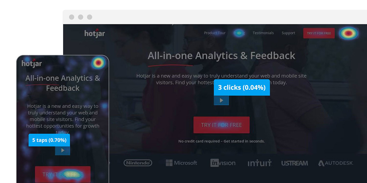
Image courtesy of Hotjar
Scroll Depth
That brings us perfectly onto the next heatmap, scroll depth. As I’m sure you can gather this style shows you how far down the page users re going. Again this uses the same colour system starting the top o the page red and colour changing to blue the further down we go. You can see the percentage of users as you go down allowing you to analyse for any points that see a significant drop. This gives you a good indication of where people abandon the page.
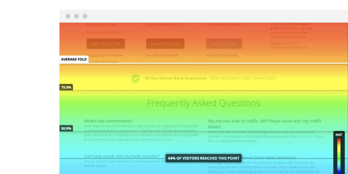
Image courtesy of Hotjar
Screen Recordings
Although a screen recording isn’t technically a heatmap, they work perfectly alongside heatmaps that they’re definitely worth a mention!
By watching through the screen recordings you can see how people are actively interacting with the page. Sometimes you can even recognise hesitations or concerns. The key thing to note here is that you shouldn’t just blindly watch them. What we mean by that is that to gain the most out of it make sure you have a specific hypothesis in mind that you want clarity on.
So for example, after viewing your click and tap heatmap you see that most people aren’t clicking on a specific element, but instead, they’re clicking on something else. So you’ll go into a session recording and you’ll look and see what is actually happening. You may have to watch a couple of recordings to back up your findings.
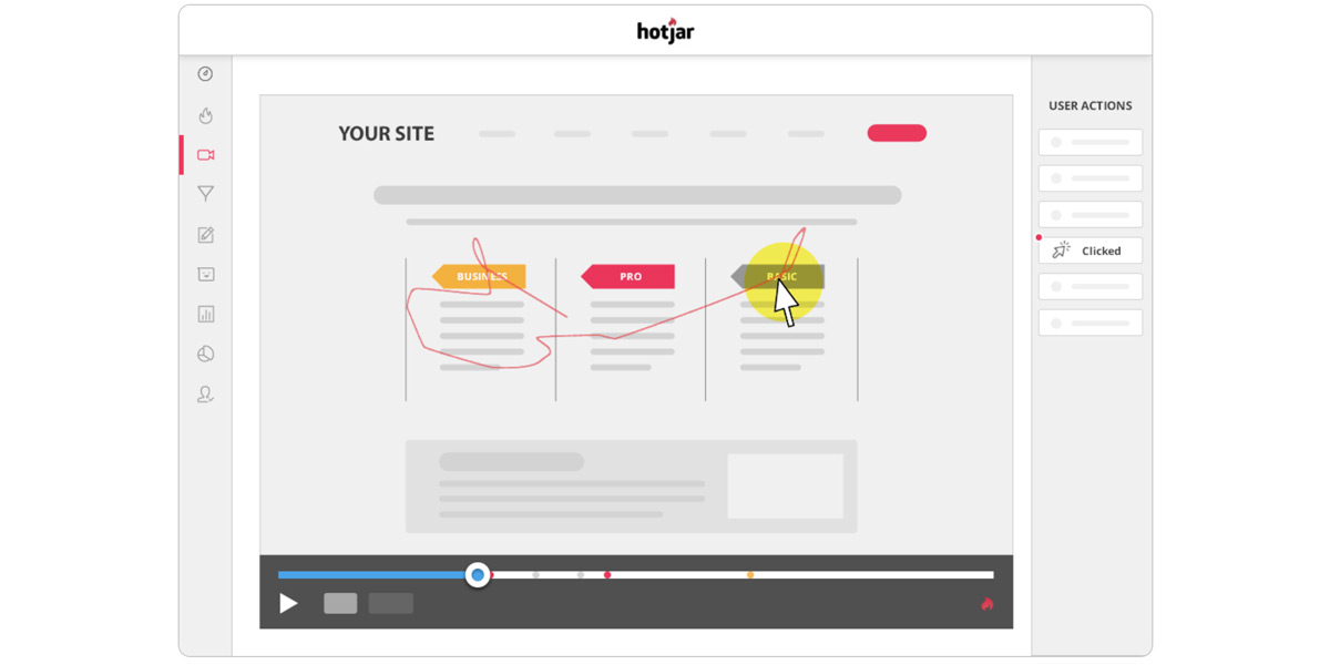
Image courtesy of Hotjar
Where do I start?
You can either pick random pages from your website, or you can do some research and make an informed decision on which pages need potential improvement. (Any guesses on which we recommend!)
A good place to start is Google Analytics. Find any pain points, whether that is within a sales funnel or on problematic pages. Then makes a list of different questions to help detect why this problem is happening such as – Are you giving users all the relevant information they need? Is the CTA obvious and significant?
Now you can set up tour first heatmap. We like to use Hotjar but there are other options out there. Give yourself a deadline, we would suggest at least a full month of data to have enough evidence to evaluate. Now you can analyse and match your findings against your initial questions.
What insights can you gain?
One of the most extreme insights you can gather from this data is if you need to redesign any pages or elements. As we mentioned earlier on, if you have any text or imagery designed in such a way that user keep clicking on them – expecting them to link through to another page, then there are 2 actionable insights:
- A need to change the design so users no longer think they’re clickable.
- A need to review what these items are that people are clicking on because apparently this is what people want to reach.
This all also leads to a potential review of your Customer Journey Map and popular content that could help further develop your content strategy.
Hotjar have put together a great infographic guide on everything you need to know about website heatmaps. But if you are still unsure of whether this is right for you or if you have any questions then get in touch studio@bopgun.com
Please include attribution to https://www.hotjar.com/blog with this graphic.

