
Our top 5 checklist in creating an engaging email
29th September 2016
As creatives we’re constantly in search for the next design and marketing trend to keep our practise up to date; and with so many marketing strategies to choose from it’s easy to get overwhelmed at which one works best. However, often we get so hung up on innovation that we can sometimes overlook certain strategies that have become engrained into our lifestyles unbeknown to us. A good example of this of course is email marketing.
Not quite the sexy marketing tool they used to be where every company seems to send one out and so they’ve become informative everyday occurrences that caution on the side of annoyance as more spam filters are created to dilute our inboxes. However take a moment to think about email…
What do you do when you get up? Continually throughout the day and before bed?
Social media updating and email checking is the norm to all of us on an everyday basis, whether this is deleting and filtering our emails down or forwarding certain ones to friends, whatever the reason, email is a valid and hard coded part of our everyday lives. Which, if you think about it, makes it an incredibly clever piece of marketing. A strategy that we don’t even realise we use and need everyday. Email has become the new safe almost antisocial filter we all use in replacement of actually speaking to someone, ‘…just email me the information…’ etc and if you haven’t noticed you need an email address to sign up to almost anything these days. However, I think we can all agree that most emails sent out today fail in certain fundamental elements that make them successful and one big element is creativity. Emails are a form of communication, an extension of our brands and identities, they should be engaging and enticing as after all that’s what marketing should be. So lets not reinvent the wheel for a moment, and take this strategy staring us in the face and instead of settling for templates, lets spruce the hell out of it.
Our top 5 checklist to create an engaging email
1. Subject line
In such a fast paced world we’ve become very impatient users, we want things now, have a very low attention span as life is so frantic. This means marketeers have an extraordinarily short window of time to engage and captivate you. Therefore, we need to make our communications count, strip back the jargon and get to the point. A great way and most successful manner in which to do this in email marketing is of course the subject line. Emails are not visual as they arrive in our inboxes. The first thing that makes the user decide to open or not is the subject line, so it makes sense that we perfect this first. But what is that works?
Urgency
An enormously successful way of panicking your users into clicking into your email, a subject line favoured by e-commerce sites in particular, is to give your product a sale, discount, a sense of urgency, a deadline, something that will make the user open your email to find out what they’re about to miss out on. E.g ‘Sale ending tonight!’
Question
No matter who you are, we like a puzzle, a bit of intrigue, we are inquisitive creatures by nature, so ask us a question. Whether it’s mysterious enough to entice the user to find out what the hell we’re talking about or a general one which questions our everyday relevances, such as out lifestyles E.g ‘Do you know where your water comes from?’ etc.
Make us an offer
We may not all be governed by it, but we all spend, save and need it everyday. Subject lines that use offers and discounts or some sort of monetary statement are very successful in click throughs. After all, we all love a bargain.
Exclusivity
We love a personalised message, “Dear David… you have won.” But personalised a side, subject lines that use a personal touch like ‘invitation only’ or ‘private member peek’ are great at drawing the user to click the read button. Just like competition emails do, ‘You are a winner’ and no matter who you are, if you see that in your inbox, you may think it’s a scam but every one of us at one time has clicked that email, just in case that one email is true!
2. Respect the norm but push the expected
As with most user facing marketing, we have a generic expectation of our emails. Now this is not to say we continue to design completely in the same manner, but certain components should remain amongst our creative designs. Messing with the location of these elements can confuse the user however, such as the logo at the top, unsubscribe at the bottom and CTA. At the same time we need to respect that although users are creatures of habit and need these components, we also naturally want to be wowed. But how do we do this?
Colour
Something as simple as colour can make the consumer stop and engage, an unexpected shade or bright colour can make our copy pop and be great at attention grabbing once the email is open. Bopgun saw this recently in the design of some packaging for a new cereal bar for our client Boka Food. 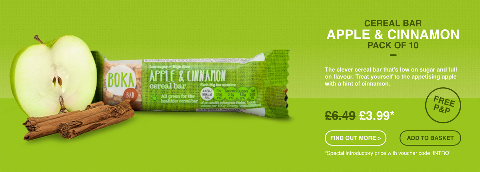 When designing the packaging for the Apple & Cinnamon bar and researching the colour ways for apple, we made a discovery. If we asked you what colour apple would be in the food world, what colour would you say? Green right? Well if you google apple right now, you’ll see that the main colour way is red. Odd no? Where did this come from? Who started this? We can use the same idea with email, introduce a colour to get the user wondering and engaged. Start a trend.
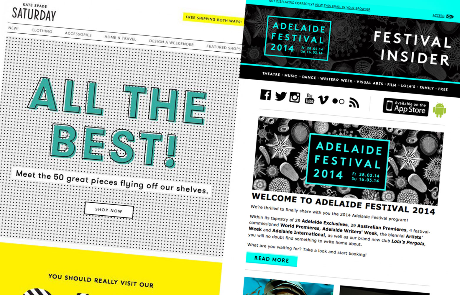
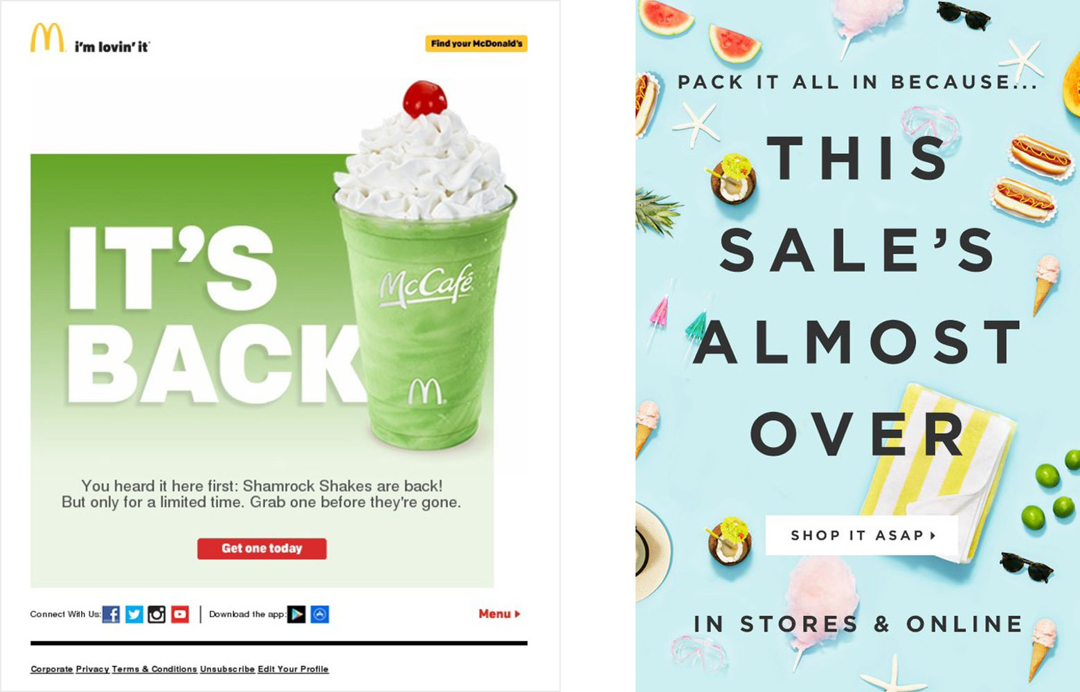
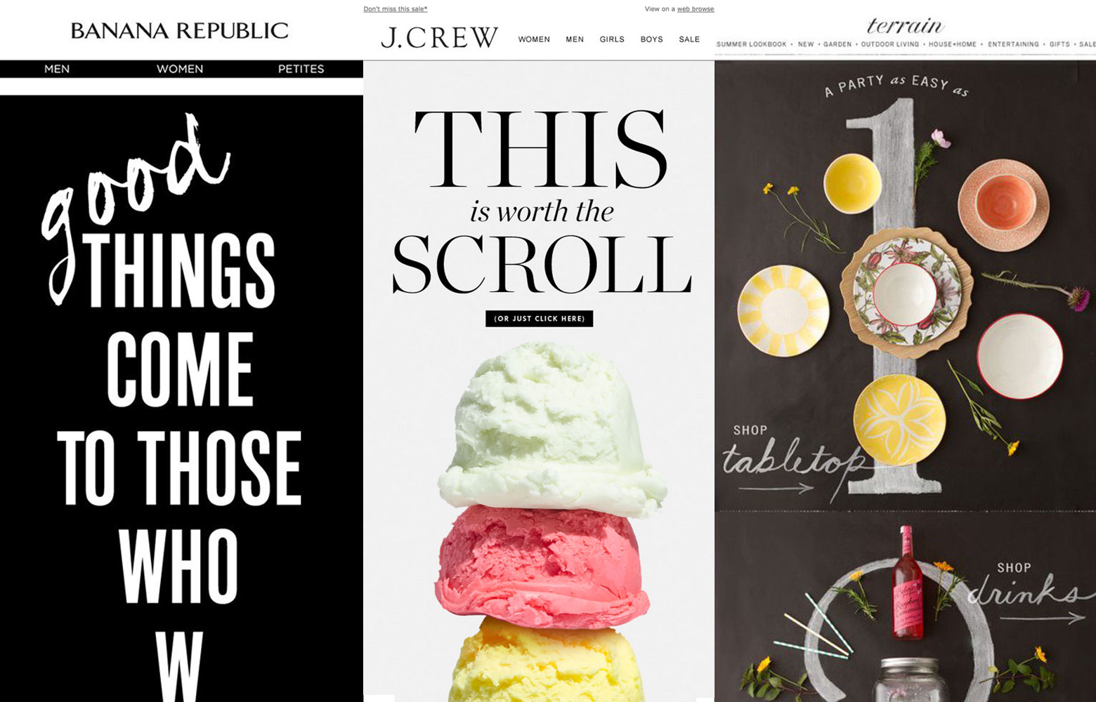
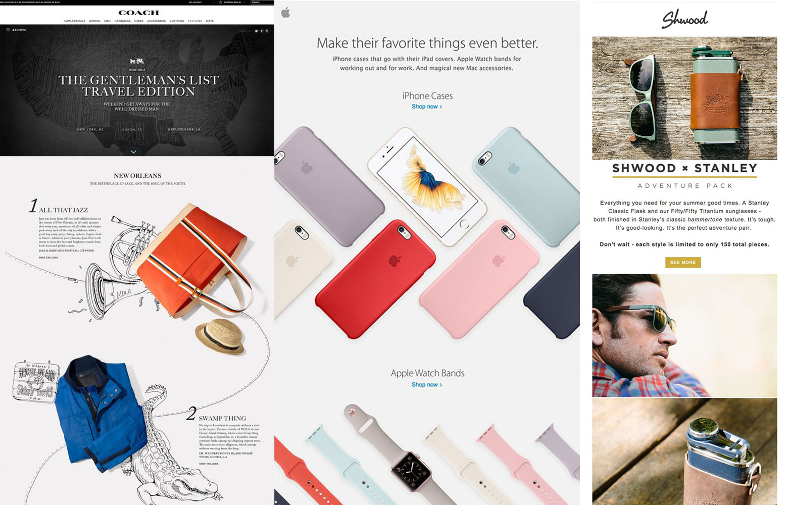
Scrolling
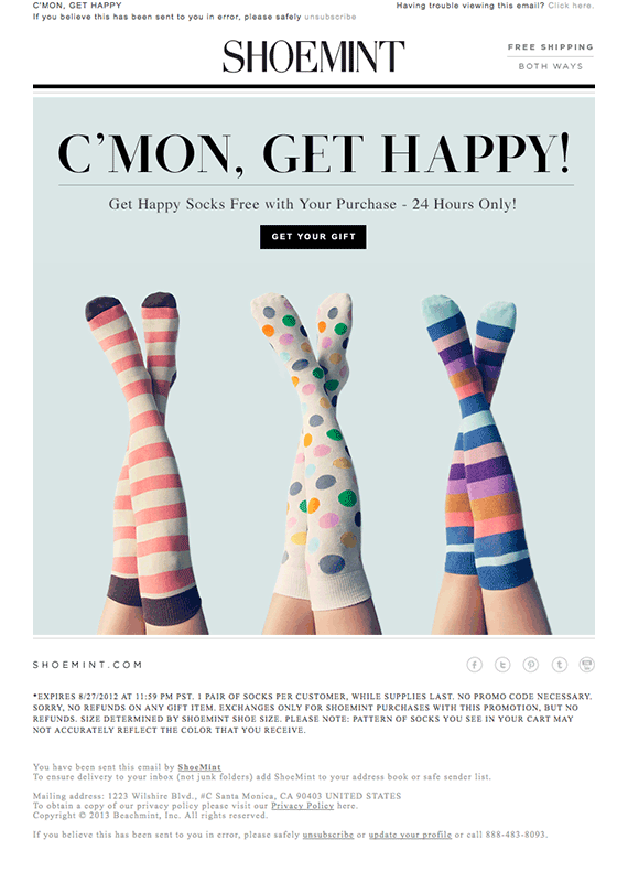
We are a society of scrollers, we have come to expect this in websites now and are comfortable with it. So why not use this to our advantage but push the norm? We almost design 2D in email today, making everything seen on screen at once, but why? Why not design the graphics in the mind that the user has to scroll to see the whole email? This creates a journey that seems almost interactive when actually it’s just simply using the function we’re all familiar with. Check out some great examples of using the natural scrolling function to our advantage below.
Angles
Use your content as signposts, direct the user’s eye where you need it to go by using the graphics and copy, this again makes the email into a journey for the user to explore without even realising it. Apple do this very well in their email communications, where their products are stacked left to right, so the eye almost drops left to right to left again until you get to the CTA at the end. Very very clever. Also remembering to break out of the template. Use transparencies don’t be confined to the email walls itself.
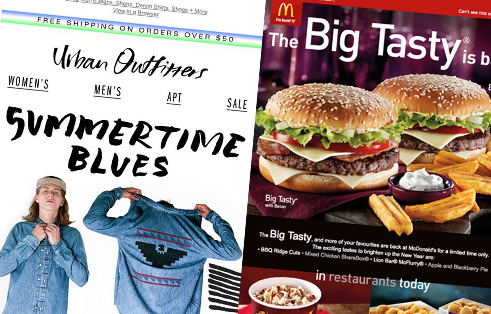
3. Imagery
A very important aspect of any email, however secondary to the subject line of course, there are many things to think about when using this element, from file size, ensuring that the number of images is not too great. Remembering that most PC email clients ask the user if they want to download their images for each email, so your copy needs to be strong if they decide not to download. Whatever the image, it needs to be inspiring, intriguing and if text is to be used on the image itself, needs to be short and punchy to ensure full user engagement.
Food companies depend on imagery more than any other industry, as the imagery is ultimately what sells their product, Dominoes and McDonalds do this very well, drenching their emails in mouth watering images of their star products. Essentially that is their USP, to make your mouth water and so they depend on their imagery for this. The user after all will eat with their eyes, show your product up front and personal, don’t hide any qualities as this will cause the user to distrust your company if you fail to show something openly, causing them to search for it.
4. Animation
Due to file size and software compatibility, animation has been a somewhat sore point in email design for many years, often looking tired or low quality which can be detrimental to the brand. However, by looking at the opportunities we have in our imagery we can use subtle and cleverly thought out animated gifs to attract the user’s attention. Another aspect in our favour here is that animation was done so badly in the past and email designs have become for the most part, so generic that not many use animation, so it’s become unexpected and as long as we do it well and subtly, it will be received well.
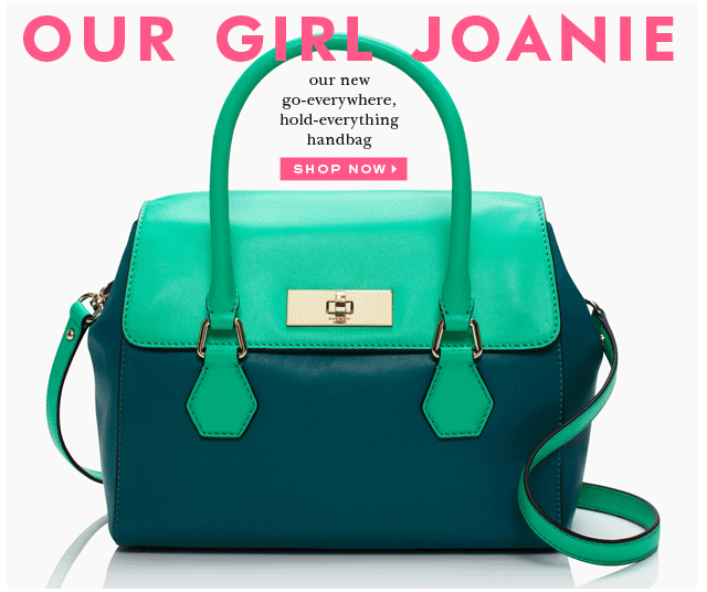
The handbag gif is a great way of getting content, here a handbag colour range into one area but not all on the screen at the same time, making the email an experience for the user opposed to just an informative one.
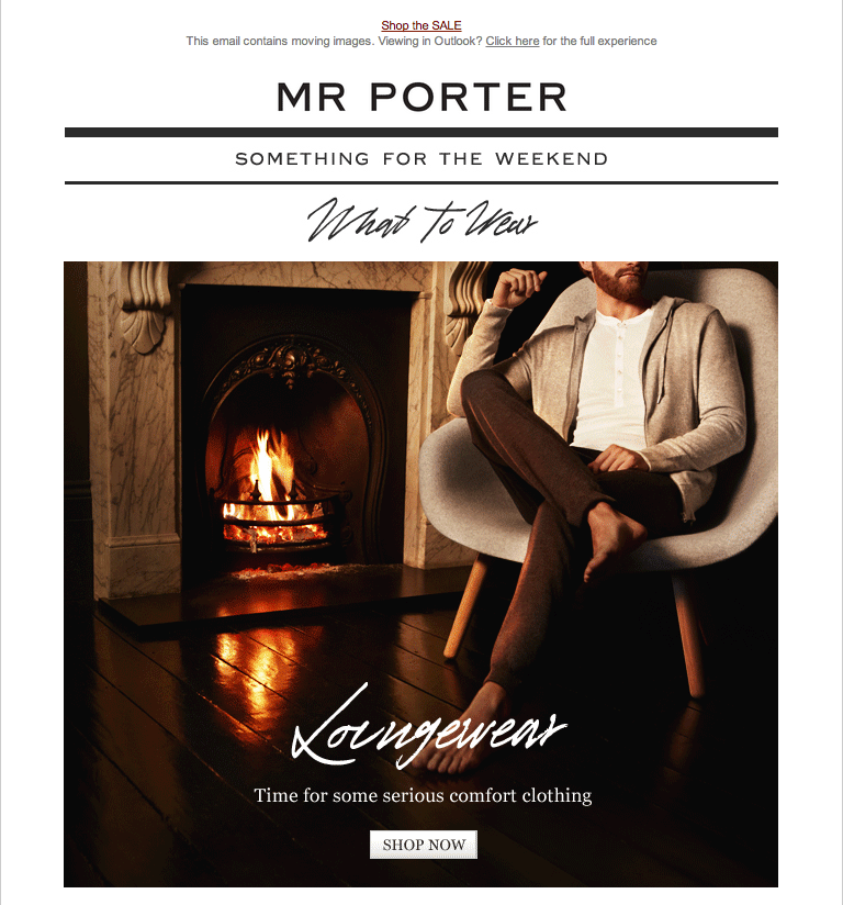
Mr. Porter do this well by looking for opportunities in the image, like the fire in the background – subtle, effective and memorable.
A really quirky animation that only enhances the brand. Really simple but eye catching and clever.
5. Copy
So you’ve done everything you can to grab your user’s attention, the subject line got them to click through, the animation and imagery continued to intrigue them, but there is absolutely no point in working hard on all these areas if then your content and message lets you down. Plan what you want to say, what do you need from the user? Is it information, is it another click through via a CTA? Also remember that the user’s time is precious and after experiencing the subject line, the imagery and animation we don’t have much time left, so keep your copy short, punchy and to the point.
Personalisation is also another nice touch here, draw them in by using their name or from data you have stored from previous visits to your website, such as “We thought you would like” is received well as it’s great for cross sell for us, but also makes the user feel like you know them. The same with reviews and ratings, don’t be afraid to add these in there if they’re good. Visual quick ratings are received far more effectively such as just the star ratings opposed to the review itself, with click throughs to read more if the user wishes. Giving them the review without endless paragraphs of copy.
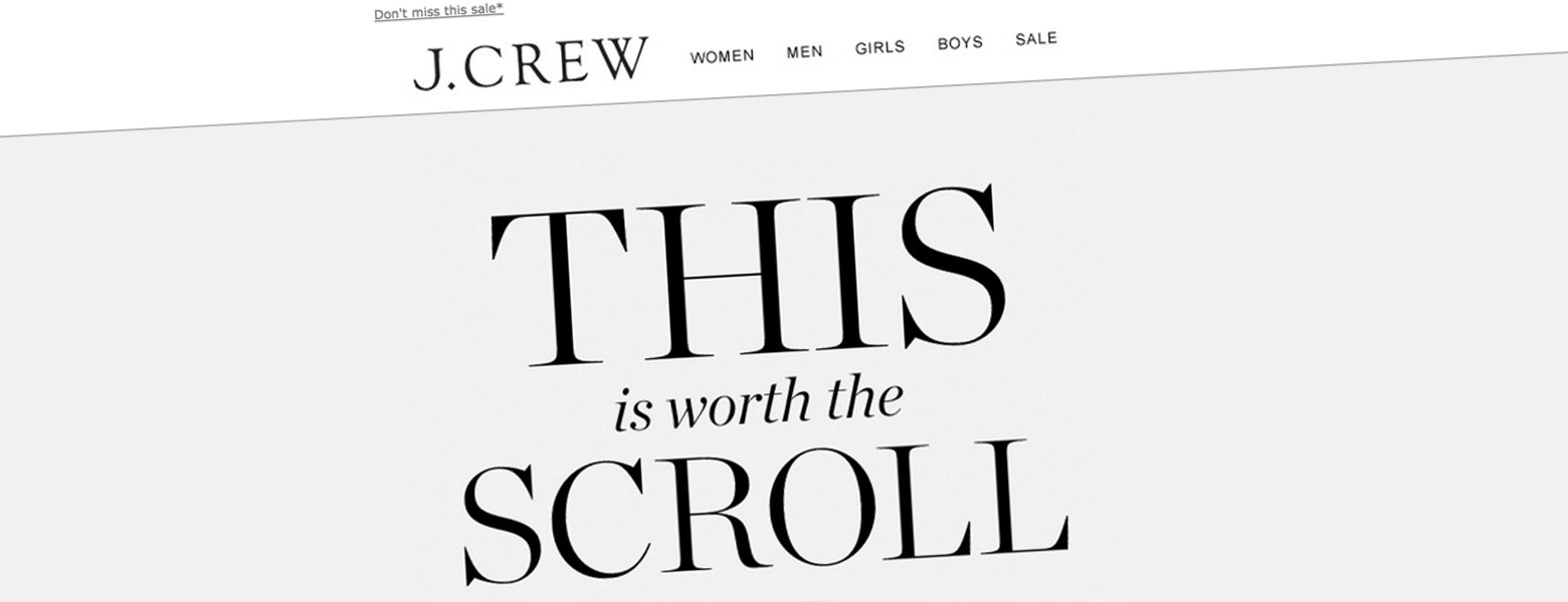 Short and to the point, really attention grabbing and instructive.
Summary
Overall, we have a good thing in email marketing, we just need to see these communications as opportunities to explore our creativity by using some of the above points. Seeing this marketing as a way to extend the user’s journey and create an experience from the very first point of call as that’s exactly what our emails are, the front of house of our companies. Draw them in with creative intrigue at this point and we’ll retain and attract more and more customers. The marketing is there, lets use it to it’s fullest potential.
