
The Power of Visual Identity in Branding
1st March 2023
It’s time to etch your brand into the mind of your consumers
Some brands have nailed their visual identity so well that there often isn’t the need for additional explanation.
You don’t need us to tell you who made this advert.

And this all comes down to a powerful visual identity.
What is visual identity?
Your brand’s visual identity is what sets you apart from the rest and stays etched in the minds of consumers. It’s crafted from a combination of design elements, including your logo, typography, fonts, colour palette, and imagery, each showcasing your brand’s unique vision and character.
To be truly effective, your visual identity should tell a cohesive story that represents your brand. But don’t feel like you have to stick to the same thing forever – it’s always a good idea to stay open to new trends and adapt as needed.
Using visual identity to create a standout brand
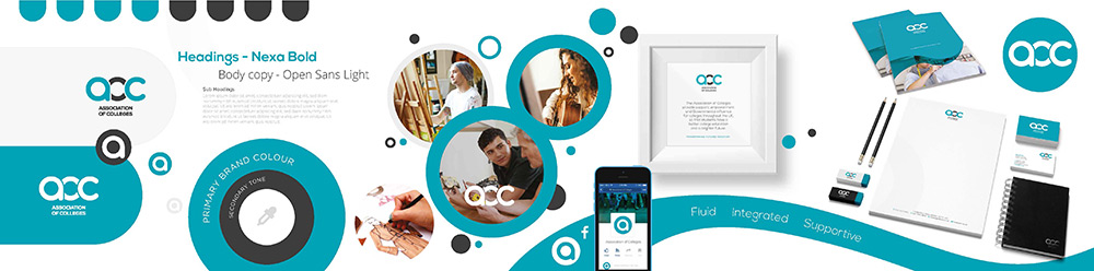
We worked with AoC (Association of Colleges) to refresh their brand. They wanted a renewed look to help represent their mission of building a brighter future for students.
Logo
What makes a good logo?
While successfully communicating the brand’s message, a well-designed logo should have adaptability and a timeless appeal as its essential attributes.
Therefore, when creating the AoC logo, we linked and overlapped the letters to represent the internal coming together of their business. The intertwining also symbolised how colleges and associations unite to benefit students and their communities.
![]()
Fonts
When deciding on a font for your brand, it’s necessary to consider its legibility. Unfortunately, while script and handwriting fonts look pretty- once in large quantities – they become hard to read. Nobody wants to have to work harder to read your message than necessary.
For AoC, we used a universal typeface for the body text, known as Body Sans, a simplistic font that is easy on the reader’s eye. For the logo font, headings and subheadings, we used Nexa Bold.
Colour Palettes
The colours you select for your brand play a crucial role in establishing a cohesive and consistent look in all your marketing works. Not to mention, colours can evoke strong emotions and connections that truly embody the essence of your brand’s personality and values.
If you’re interested in colour psychology, give our blog post a read to see how colour impacts consumers.
To create a strong visual identity for AoC, we chose a blend of eye-catching and neutral colours that would resonate with students, colleges, and staff.
Imagery
Images have a way of speaking to us that words can’t match. By using images that are both consistent and fitting with your brand, you can give your brand a personality and set of values that will make it unforgettable. Rather than relying solely on text, let your imagery tell your brand’s story and create a lasting impact.
The imagery for AoC was a defining factor in its identity, with a focus on lifestyle photography showcasing the students and emphasising the brand’s values.
Conclusion
Overall, it’s essential to invest in your brand’s visual identity to help you leave a lasting impression on customers and stand out in a crowded market.
It’s time to embrace the power of visual identity and create a lasting impact. In fact, why not get started today? Let’s start a project together.
To see our AoC work in action, check out their website here.
