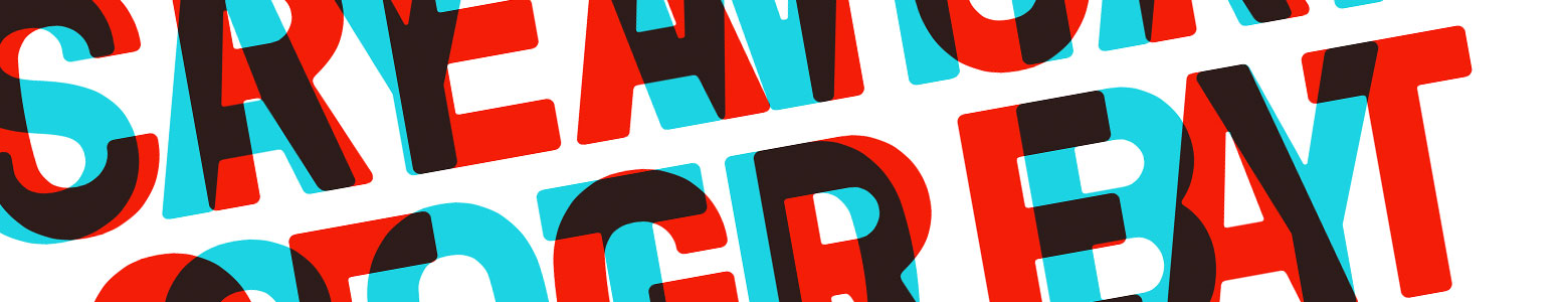
Creative uses of typography
9th June 2016
In such a fast paced world, where we have no time to listen and need information quickly, we have become a nation of readers, which may sound odd as reading takes more time; but with interface design making our everyday devices easier and quicker to access information, we’re finding that whether you consider yourself a big reader or not, everyone today is reverting back, as it’s something we can do in our own time, when we’re ready.
From emailing opposed to calling and Skype messaging to texting, something that we see every day of our lives, from the most basic level of signage on motorways and hospitals to magazines and advertising, there’s something that we all interact with and use without even noticing its presence. In the design industry of course, this design ingredient is one of the most basic components in all good creative, which dictates how the main star of any design, the content, is communicated, of course we’re talking about, typography.
Whether utilised as a solo creative, dictating the visual itself or playing a supporting role, however we use it, consideration of how it looks and works within our designs is key to creating a solution that will communicate and keep our users interested. Over the years of course there have been numerous font tools and kits created to help designers pick that all important font that will essentially dictate a brand’s overall identity. From Adobe Typekit to Google fonts we are constantly spoilt for choice in what types to use. Although in a world that gives us so many options, it’s easy to find selecting this important component daunting, so how do we know which font to use?
Sans Serif or not to Serif?
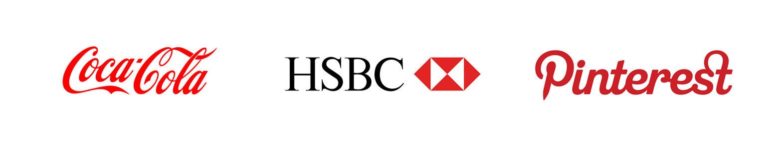
More and more we’re finding that typography is becoming the logo mark for most brands, where the icons / visual idents are being left to one side and the font taking centre stage as the logo itself. This of course makes the typography oh so more important. For many years, numerous brands have played between Serif and Sans Serif fonts, evolving their mark to suit recent trends. For a long time we’ve seen the Sans Serif font type dominate the brand world, using an almost minimalist approach, adopting a white space, laying the brand bare sense, connoting the reputation of a brand’s values. Which has worked and is still being adopted by so many.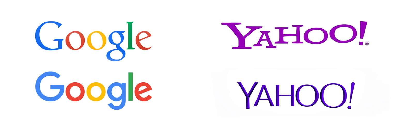 However, with higher resolution retina screens growing in popularity, we’re seeing a return of the Serif, where brands are putting their reservations about legability to one side and finding their confidence. Especially in bigger brands seeing the significance of their heritage in their serif logo and not refreshing to the minimalist style but retaining their brand strength.
Just like fashion, typography types are always changing and depending on what’s in fashion on zed week will be the main driver in refreshing a brand’s identity. Designers and developers however are finding other ways of making their typography inspiring, using clever methods that vary from concealing or story telling to becoming an interactive element that will make their user engage with the information. Below we have picked out just a few sites that use typography and interface together, creating clever, inspiring solutions.
1. Miss. Mary’s – Great parallax scrolling use and centre stage typography
A strong colour palette and quaint 40’s styling aside, the typography is gorgeously put together and acting as the title for each section as you scroll down where clever parallax scrolling reveals the next section heading. Also having the confidence in using capitals for the main intro text. Lovely.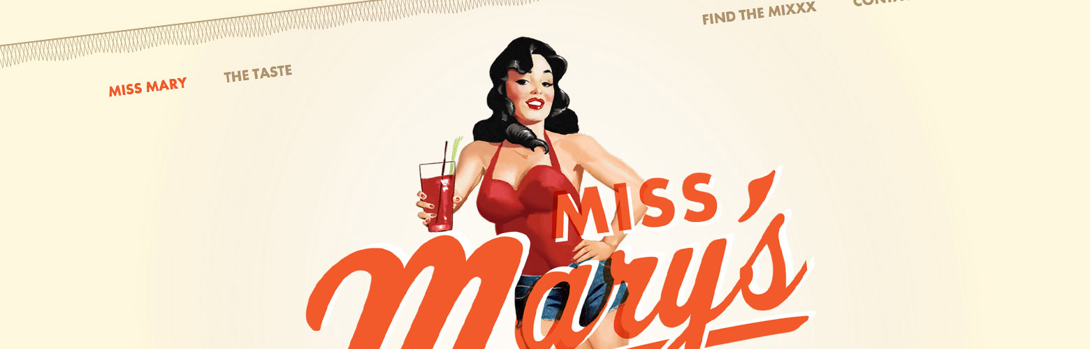
2. Type to Design – A real typography lovers site
A clever little site, where you type in a word as you enter the site, then your word is transformed, using different letterforms taken from signs, newspaper etc that change as you click on each letter. Really cute and clever way of getting those creative juices flowing. 3. Sonikpass – Using typography as a visual
Nice interface solution, using the typography not only as a background image, but indicating what section you’re in and where you are on the site, paired with a slick and quick animation between words.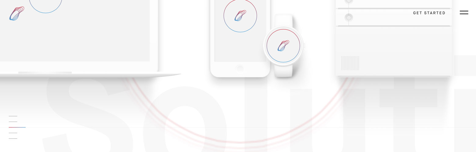
4. In space we trust – Typographic and engaging storytelling
The site gets the user to use the arrow keys to navigate and control their own journey through the little man, travelling through each section to reveal more information. Pairing it with some interesting music, the only disadvantage being that it’s in Russian, but love the typography and technology in the site.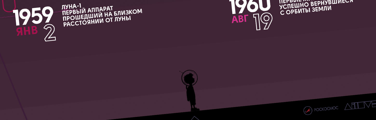
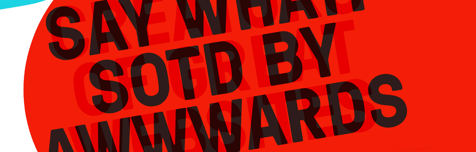
5. Bolden – Using colour and typography to reveal hidden messages
A clever way of getting a lot of information across, when you still want to maintain the white space ratio.
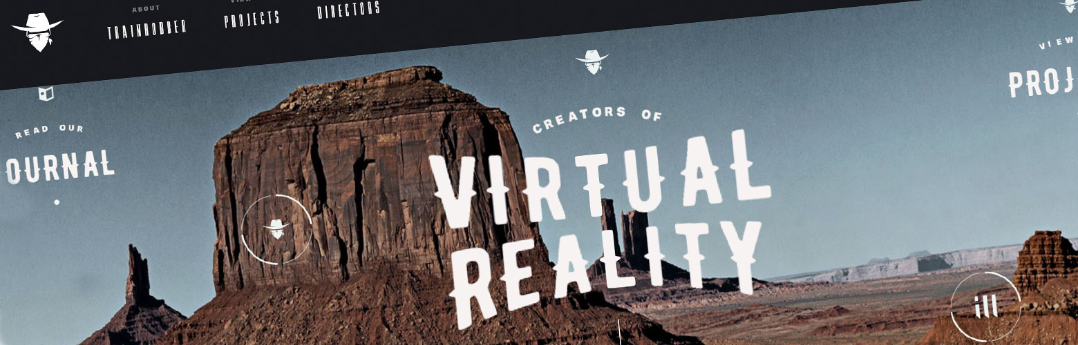
6. Trainrobber – Exploratory typography
A lovely engaging site that sees the user navigate around via parallax, masked areas of crafted typography that uses the image as the actual menu.
ReadMap – Bopgun’s favourite typography tool of the week
ReadyMag have created a great tool to help you when you’re trying to pair different fonts together, which is a great help when creating brands or designing for web.
