Colour
18th April 2016
An integral part of everyday life, whether consciously or subconsciously, governs the way we shop, dress and even eat. It can stop us shopping for that perfect couch or piece of clothing if it’s not right. It can make us feel differently when we see a poster or campaign and even stop us in our tracks in the supermarket, through the packaging we buy or the fruit and veg we pick; where we clamber through the mounds of product to get the most luscious looking produce we can. It can also be one of life’s pleasures with its own narrative, when we see things that are so exceptionally beautiful for instance, that it makes us lost for words, such as vibrant Rapeseed or a crisp Winter’s sky.
This leads us straight into our Best of the web subject this week, Colour.
In design, this is one of the most integral parts to any brand. Getting it right is such a hard task, but when you do, the rewards are endless. A great example of this is the company “Orange,” they live and breathe by colour, both in their actual name and colour of their brand. You won’t see these guys settling for a CMYK makeup close to their brand colour, oh no, it’s what their whole brand is based on and without that strength to ensure everything conforms, their brand would lose it’s validity.
Click here to see our ‘first find’
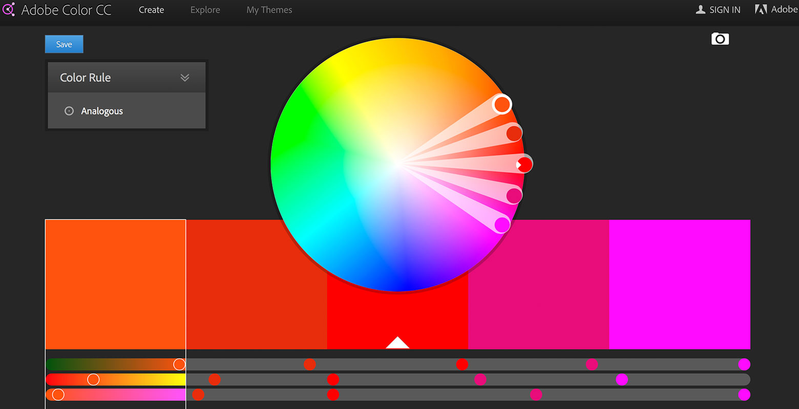
1. Adobe Color (Kuhler) – Effective colour palette tool
Brand identity is probably one of the hardest things to get right, not only design, but in also colour palette. And although there are endless forums to help you understand palettes, sometimes a good tool would be useful. So we present our favourite, Adobe’s Colour (Kuhler). Whether you’re looking for a 6 colour main colour palette or a 3, Adobe Color is great at showing you what shades are complimentary and work together. You can mix and match and programme it as much as you need to, but it’s a great starting point for any designer struggling to get that all important brand palette working. It also has a great way to get your creative colour juices flowing, by showing you hundreds of palettes that people throughout the world have collated. Seeing what has worked for others and taking inspiration to create your own. It’s a Bopgun favourite here in the studio.
Click here to see ‘find number two’
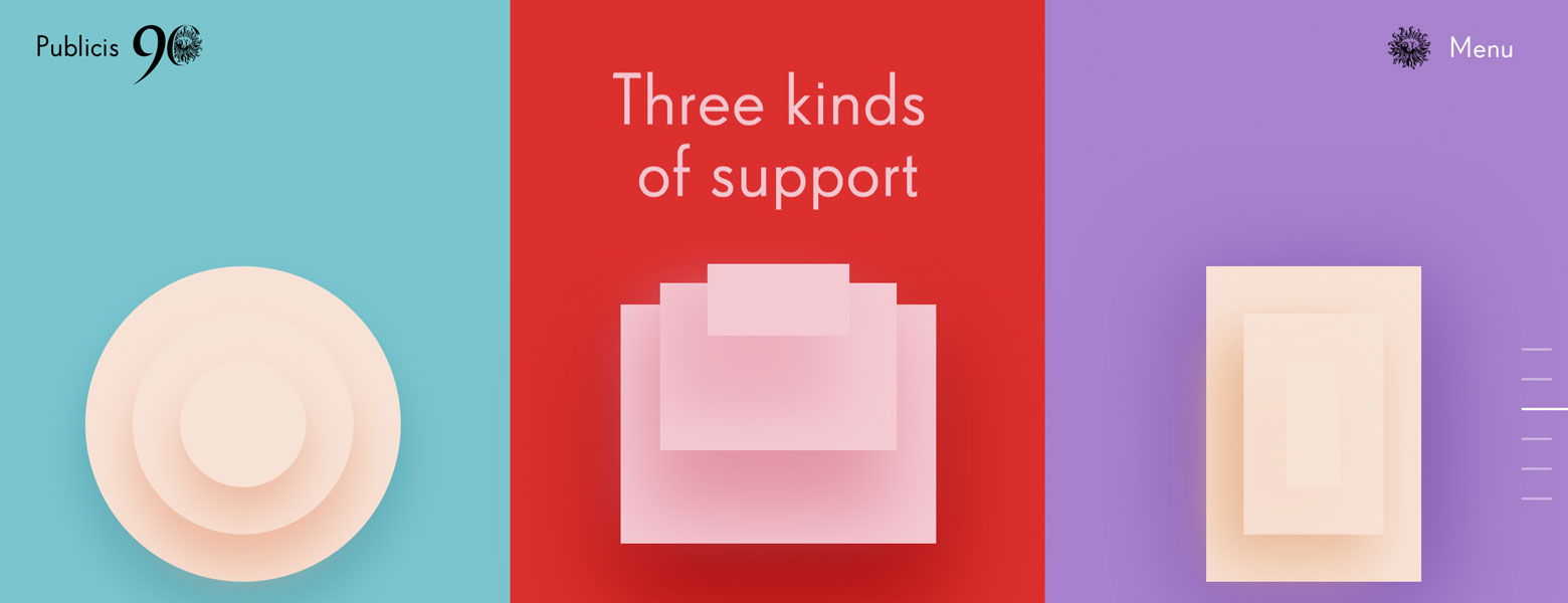
2. Publicis 90 – Great use of complimentary colours
Celebrating 90 years, Publicis have put a site together that showcases how colour can influence our experience. As you navigate, scrolling through the site, the site changes through a combination of vectors and animation, but as it flows into the next section the colour changes subtly so not to overwhelm the user. Starting with pastels and building up to stronger tones. A clever way to ease the user into the site and keep them feeling at ease without a sudden shock of colour, creating its own narrative.
Click here to see ‘find number three’
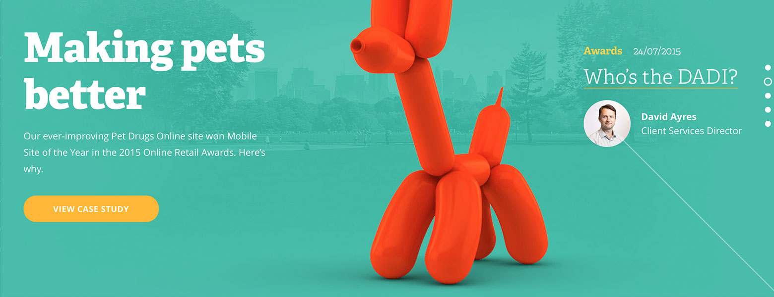
3. True Digital – Design Fave
Sometimes a site just makes you smile, and this is that very site. Clean, good use of photography in the background that elevates its great colour palette; bit of character in the foreground which is complimented by the colours again. A very well thought out design solution, that uses its palette to entice the user.
From one end of the spectrum to the other (it was there, we had to go for it, sorry guys)

Click here to see ‘find number four’
4. Bjork – All is full of love video – Black and white VS colour
A mainly monochrome video, that is transformed with slicks of colour hazes throughout the song, to highlight moments of the chorus and integral character moments. Making this very surreal but showing that not always is a lot of colour needed, but just a slick to highlight can change the whole mood and look and feel of a design solution.
Click here to see ‘find number five’
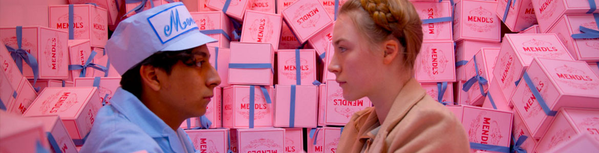
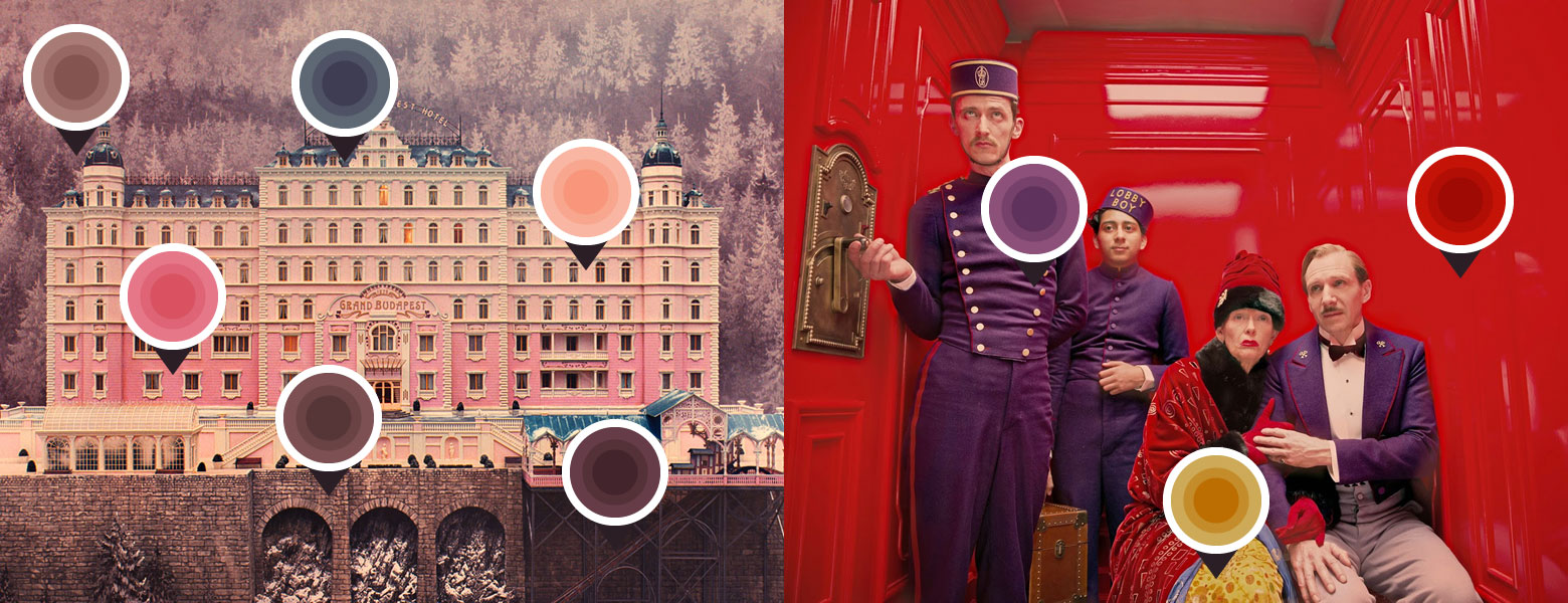
5. The Grand Budapest Hotel film – The world of film and colour
Wes Anderson’s masterpiece showcases just how colour can elevate and embellish a great storyline and make it spectacular. With his unusual colour combinations that mix between an array of pastels with a few stronger tones, it’s easy to see why this film was so well received. Each scene has been considered very carefully for it’s mood and tone and complimented with great print design material by the Graphic Designer, Annie Atkins. All the material has been beautifully handcrafted, both in colour and design, which adds to the raw, handmade feel that makes this a crazy, beautiful and crafted film piece.
