Engaging audiences in customer journeys
20th December 2016
The customer journey, one of the most researched and constantly changing aspects of marketing today. We are one of the biggest online consumer nations in all of history, our lives resound mainly online through email, social media, to gaming and Skype calls, and in such a digital age, and such a multiple platform and device era, the customer journey has become one of the biggest budgeted areas in marketing. As at the end of the day, it’s all well and good to have an amazing product, but without the right consumer journey to get you to buy the product, you could lose the sale completely. But it’s a not just the journey that needs attention, as once the breadcrumbs have been set out for the consumer, how do we then motivate and engage them to follow the trail?
Good vs bad customer journeys
A good customer journey needs to be seamless between devices, so the user doesn’t get confused or worse, have to relearn a new journey to be able to do a simple action.
Netflix
A great example of seamless device channels is one of the most popular journeys especially over the festive period, Netflix.
Desktop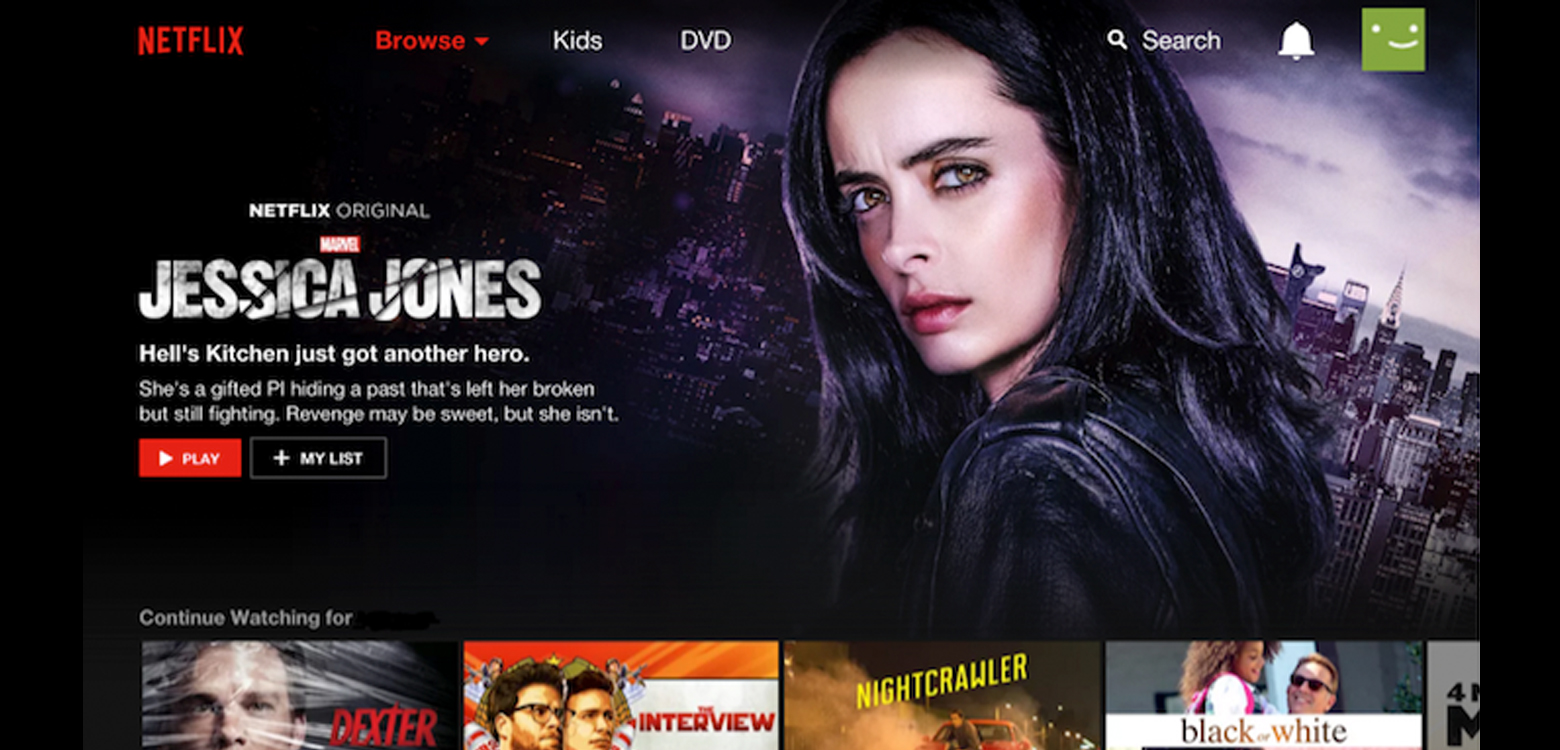
TV
On a desktop, the site not only uses generic conventions such as keeping the menu at the top, as well as its browse filter, search and log out but also the way it structures it’s screen in an archive, thumbnail manner is very similar to the TV view. Even on its TV interface, the menu button on the control is the fall back button of choice, similar to the generic conventions of the desktop. However, it’s not only the functional nature of why this site works so well. It’s the seamless stream of episode watching and from a site popular by its endless archives of boxsets this is a journey they needed to get spot on. If you start to watch an episode on the desktop, get interrupted and close your laptop and then go on to your TV to watch the same episode, it remembers where you are from the close of your laptop and offers you straight away to resume or start again. From someone that does this a lot, switching devices and sometimes doing it in just a few minutes, the speed it remembers and switches from one device to the next is brilliant. The journey is fluid and articulate.
Compare the Market
Another great journey is that of the giant insurance aggregator site, Compare the Market. Insurance is a bug bear for most of us, especially when it’s a legal requirement that you may never use but still have to have just in case. So with this in mind there is extreme importance in making this already ‘bad rep’ journey as good as possible.
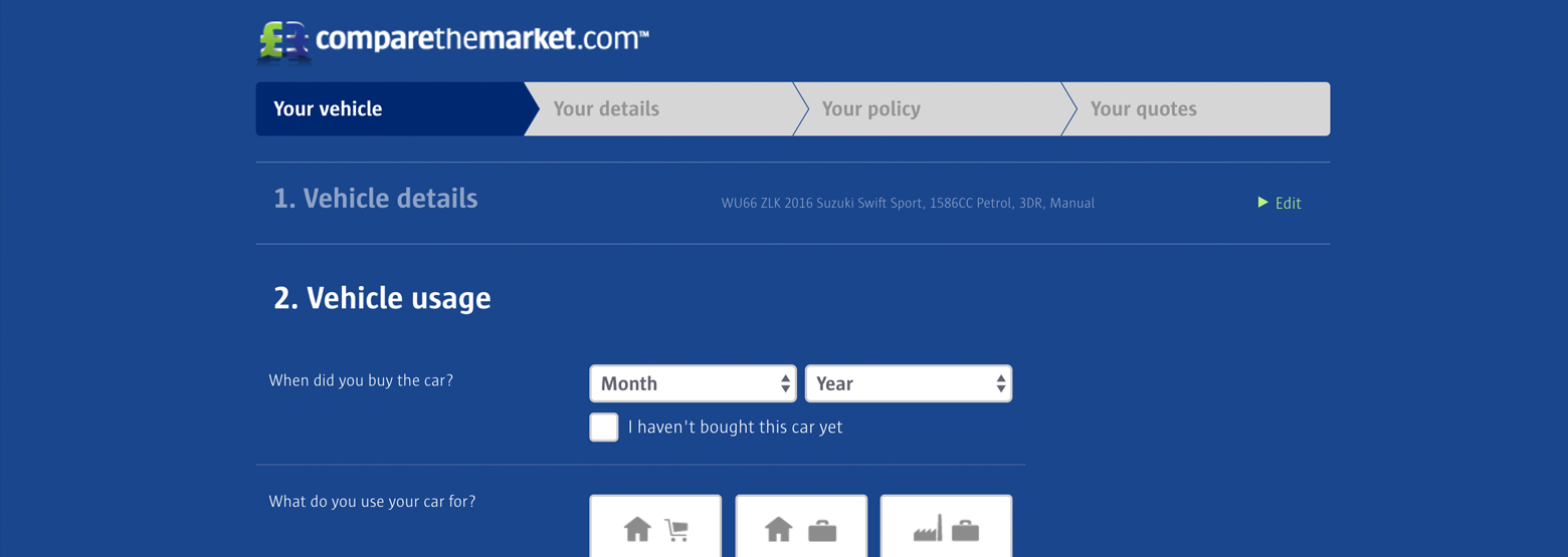
First and foremost, they save your details, so if your session is interrupted, you run out of time or get distracted, the site will remember all your details and in a handy fashion, emails you as a reminder to offer you to complete your quote.
As our time is precious and our attention isn’t 100% in doing this compulsory buy, we are creatures that need an endpoint. This site is structured in a way that it shows you with a clever dash across the top, the stage you are at, at all times, as well as sectioning the information in each stage so it’s not just an endless list of questions. Seeing the finish line is quite rewarding as we know there’s an end and with the ‘edit’ facility on each section we can flick between all information to any point, opposed to other sites that force you through the whole journey.
Photobox
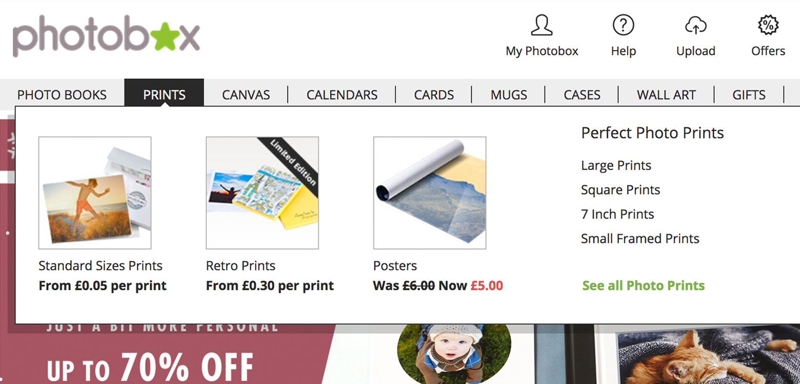
One site I’ve personally been frustrated by recently has been Photobox, but not because of the product, which was immaculate, but the journey to get there. I believe that no matter if you’re a member or a non member, subscriber or none, that the journey should be good for both parties. Obviously the subscriber and member will get benefits, that’s not the issue, however the way you purchase something should be the same easy process, no matter which category you fall into.
Having not used Photobox before I recently went on to their site and ordered a couple of A4 prints, which seem simple, upload an image, select size and pay. After nearly 2 hours of frustration from loss of location of image uploads as there was no generic area in the menu to losing connection as the site was busy, to the images falling in and out of the basket. Although the product has now arrived and is excellent, has put me off in the future and pushed me to their competitor Snapfish. Which just proves, the product may be the better value and quality, but if you frustrate your user it will tarnish their view of your company.
However, after doing some rough research on other users of the site, have recently found out that if you are a member to the site, then you see a completely different dashboard and it’s very easy to navigate. So my question is, why do sites put so much time and effort into clearly two different journeys in this case, when they could use one (the member one), just omit the member advantages but manage to keep their non members who may, if given the member journey, registered with them? However, on the flip side here, could this be an indirect way of the site encouraging us to join and become a member to save frustration? A risky strategy but a memorable one.
How to keep consumers engaged
There are many different formulas in getting the perfect customer journey for your service or product. However as a general run down we’ve put together our top ten favourites to get the job done.
1. Personalisation
We all like to feel like huge companies are speaking directly to us, it makes us feel special. Saying the consumer’s name ‘Hi, Jon’ as they enter the site can engage and reassure the user via emails or whatever platform, to feel a part of something bigger and in turn make the more inclined to part with their cash.
2. Breadcrumbing
A pretty basic step in web design, but being able to retrace your steps and quickly can be the difference between keeping attention on your site or leaving it altogether.
3. Responsive
Again you’d think is a very obvious step but it can be alarming how many sites these days still haven’t caught up with the device revolution. Taking the time to map your device journey next to your desktop and considering them differently but keeping them seamless all the same can again be the difference in keeping you audience and losing them.
4. Social Media
Social media is an integral part to our lives today. Ignoring it is for the foolish. Facebook boasts 1.59 billion monthly active users. With a stat like that it makes sense to use facebook advertising and breadcrumb your consumers as an extension to your customer journey, integrating it opposed to treating it separately.
5. Video content
We’ve discussed this one in previous posts, as being in such a digital age makes it hard to show our consumers our products and services first hand. Medical sites are starting to adopt video conferencing with their patients as a way of still having that face to face contact strategy, as seeing someone is more engaging and believable as you can view their expressions first hand. We’re even seeing blogging or ‘vlogging’ go this way now, where opinion is being filmed and shared, making the anti social hiding behind words more social by seeing them speaking their words, almost opening the digital age back up again. We’re seeing video appear on shopping sites and becoming easier to film and upload on our phones, showing that video is up and coming and should be integrated and not ignored. One big reason however has got to be that people are more inclined to watch than read these days, hence the boom of video tutorials so it makes sense to integrate this into our content as another strategy to engage our users.
6. Device gaps
Making sure we map the journey, as Netflix have done, seamlessly between devices for when the user needs to switch between them. Constantly checking analytics on device gaps and new tech to keep ahead of your audience’s expectation.
7. Device channels
Similar to social media, making sure we are aware of external journeys that could affect our main journey such as social media, integrating both so the user knows they’re with the same company for instance as the branding is similar on both journeys.
8. Cross selling
This can be a grey area if done badly and not considered carefully. To positively cross sell is to map into the journey the decision points that the cross sell can be used. Embellishing their next step with an adornment of cross sells to pick from will work well, such as offering a voucher code if they register on checkout. Showing this cross sell afterward would be annoying and discouraging. Keep them on the yellow brick road as long as possible.
9. Generic convention
We are indeed creatures of habit and although we are very adaptable, certain things we like as is. These are mainly functional usually, such as menus as burgers or having a search facility or login at the top. Remembering to innovate outside of these types of areas will not frustrate your user.
10. Load time
A massive point on all journeys, whether it’s an e-commerce or service, research your busy times, e.g. Christmas etc and ensure that your site can deal with the amount of traffic. Reduce imagery or find ways of reducing load time to a site. Generally although you may not think it in such a fast paced world, we are patient creatures and we go to a site as we want something so subconsciously will wait a period of time, but keeping an eye on load times is always a good idea so not to discourage.
Great customer engagement

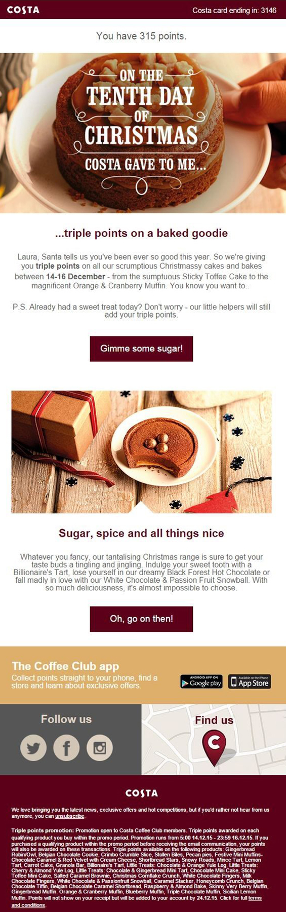
Costa have always been a great one for customer loyalty, rewarding their coffee drinkers with club points each time they visit. However this Christmas, they have stepped it up with an array of targeted emails to Costa Club members, but with a festive menu edge. Sending out animated gif emails offering incentives such as an ‘extra 200 points’ or ‘money off your favourite latte’ you last had in store or ‘money off a certain hot chocolate that day if you went to Costa.’ A very very clever unique engagement, where the company actively cross sells and gets people down to their stores by just playfully notifying them with a nicely animated follow up email exclusive to their coffee club members. Really subtle and a somewhat ingenious way of selling more, extending a user’s journey by getting them down to their stores where once there they’ll probably buy a cake or bring a friend too. Very clever.