How to use your blog to engage users and potential clients
6th October 2017
Clients come to us ultimately because they have a marketing challenge, they need our expertise and knowledge of a daunting industry to be able to get their brands out there. It’s therefore our job as marketeers and creatives to make this journey as effortless and informative as possible and the same goes for the target audience. Often however, before we even get to the job, clients and users will research a company or brand looking for good reviews and design work that will persuade them to choose us as their partner in the journey ahead. But it’s not these aspects alone that help in making the decision.
Everything we do as brand is judged, from a logo change to our design work and opinion, we are continually being critiqued. Millennials for instance look for a brand’s charity donations, fundraising and support as part of their buying decisions. One tool however that is regularly forgotten and can be used to market ourselves, is to practise what we preach. Everyday we create stunning work and marketing strategies for our clients, but often forget about our own brand’s marketing strategy. This ultimately should be easy for us as we do it every day, but finding the studio time and scheduling in effort can seem a little daunting as there is no direct monetary value to come from it, so we often ignore or bring in companies to help us. The truth is, we actually have a great outlet to not only communicate our opinion and work but also our social, charity and potential as an agency and it’s right there in our company blog.
Often overlooked, the company blog is your direct window to clients and users and what you do here defines both your brand and what you can do as an agency. For instance, if you regularly update your blog with social, design and marketing tips and fresh thinking from the studio, this connotes that you take as much care about your own brand as you do your clients. It’s also a great way to get new work in the content sector. Whether you use a copywriter or write in house, to clients this shows you can create written content as well as the visual, development and strategy, adding another string to your bow. What’s not to like? But what makes a blog readable and engaging?
So what is a blog?
A blog is essentially a brand’s voice and opinion that enables the company to communicate on a platform that is shared by millions. With the popularity of emotional intelligence marketing, the need to be relatable and communicate with your audience is crucial to a brand’s content marketing strategy and ranking in social media hierarchy. In a world where the validity of information plays a big part, blog’s and reviews are increasingly becoming the ‘go to’ and trusted place to get the ‘REAL’ opinion and information, which covers all industries, from Tripadvisor reviews to creative ‘Awwwards’ type sites. No matter what the content, it seems to be a highly valid point of contact for most brands to convey their opinions without fear of audience scrutiny, as at the end of the day, it’s an opinion. But equally so, by saying the wrong thing or displaying your blog in a confusing visual way can be detrimental to your brand. So what makes a good blog?
10 checklist tips in creating an engaging blog post
1. The subject
This is the most important part of any blog as ultimately the subject and link bait will together drive readers to your material. Therefore it needs to be juicy, helpful or different as well as being well researched as it is essentially the foundation of your design, opinion and voice. The subject creates purpose, without it you risk boring the reader and possibly find yourself going off on a tangent with no true conclusion. Facts and opinion can also help reinforce your point helping you to communicate your meaning and break up endless paragraphs, plus we all love a juicy fact to tell our friends.
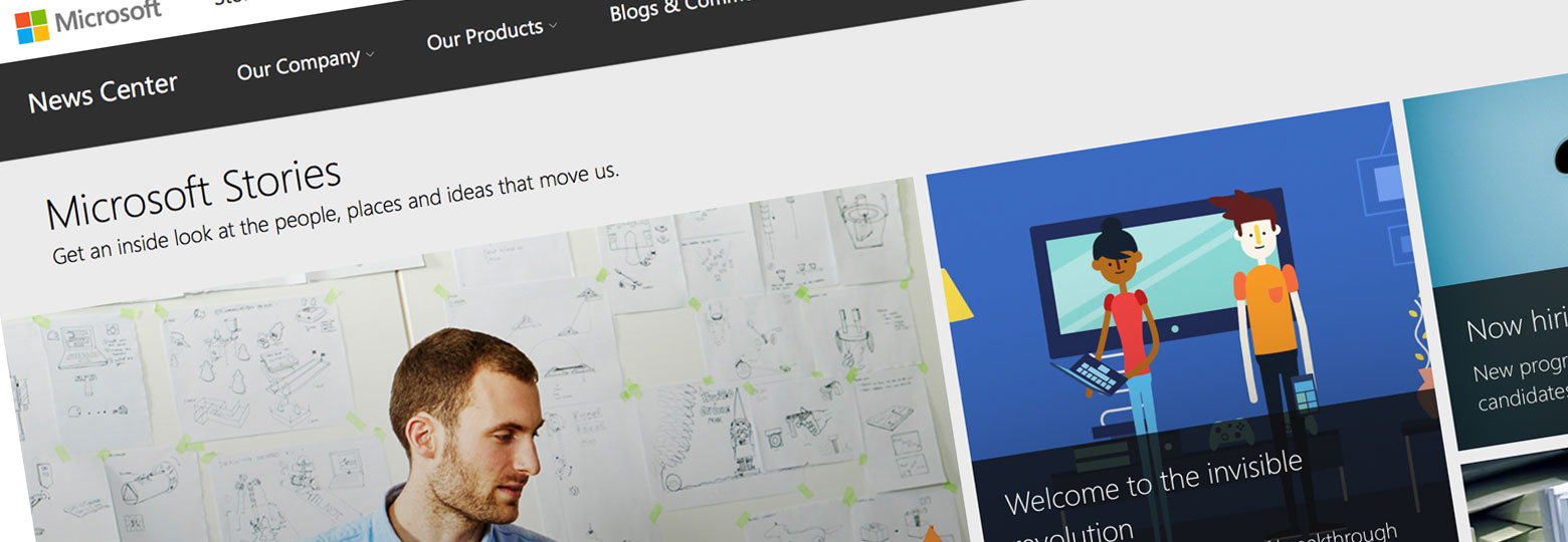
Microsoft Stories showcases its blog with a photo album feel, a different approach to the usual white out text areas on posts. It brings you into the story and is colour coded as per the logo 4 colours, so you know where you are at all times. Not sure if the headlines get lost a little bit however. They’re very dependent on their images here being spot on.
The writing style
How you address your reader is also something that must be consistent throughout your posts. Are you setting yourself on the same level as the reader or are you informing? Maybe you want a different style for different sorts of posts. Opinion pieces may be very speculative but a charity fundraising event may need to be more social. We all have our own formula, it’s just finding what’s best for you.
2. Headline
This needs to reveal enough about the blog subject but leave just enough intrigue to get that all important click through. It also needs to be big and it needs to be punchy. Equally, the length of a headline has to be carefully considered, about 9-12 words should work nicely. But what about the typography? Well this should also be a strong consideration. Well crafted or stacked type can help a blog post demand attention just as much as the subject itself. But remember your brand guidelines for this one, you don’t want your blog to dislodge your main brand identity and stick out like a sore thumb, potentially confusing your reader.
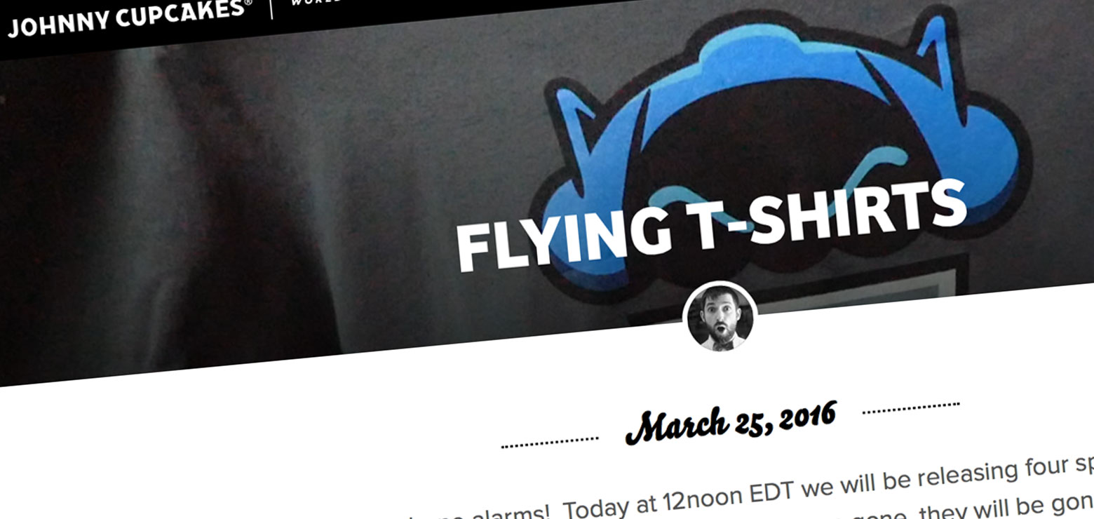
Johnny’s Cupcakes have a lovely centre align to their typography as well as the additional author thumbnail, adding a bit more validity and personality to the post, which works well with the full width image. This is an example of their blog archive page, which may seem unusual as full screen images, but seems to work well with the strong headlines.
Sub headline
The Headline’s wingman. Not essential but many blogs use this technique to further split and categorise their content. Smaller in font size, the sub headline should reinforce by giving more explanation than the headline but still teasing the reader by not giving too much away. Almost like a short teaser trailer with a little more depth than the main headline. The sub headline can sometimes be considered to be more important than the headline itself, as this defines a scan reader from an actual reader.
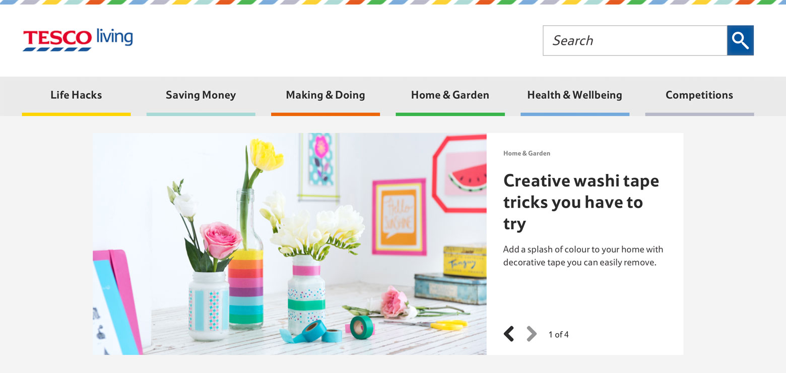
Tesco’s colours are vibrant and inviting but also have a dual purpose by categorising the blog easily so you know where you are at all times. Strong and considered photography helps make the post pop also. This is a great example of how a headline and sub headline work in harmony with each other.
The snippet
This little nugget usually comes from the first few lines of your post but on most CMS you can write a separate teaser paragraph that will draw your reader in. Remember this is what appears on blogs that are pulled through social media and ultimately will be the first few lines a reader will see. Make it catchy and draw them in.
3. Copy typography
You’ll be surprised to hear that the usual font size is 14px for a blog post. 12px may be standard for web design, but as the internet grows, we are finding that we are starting to cater our sites to work solely across all devices in a fluid design, one design and size that when scaled, stacks etc but works for all audiences, young and old. So why not increase the font size to accommodate. As far as how to display the text, standard typography practise should be used, which is no great mystery but breaking the copy up into small paragraphs can really help keep a reader interested. Or another craze is to use a ‘Listicle.’ Breaking up your article into bullet/number lists which helps make your post more digestible.
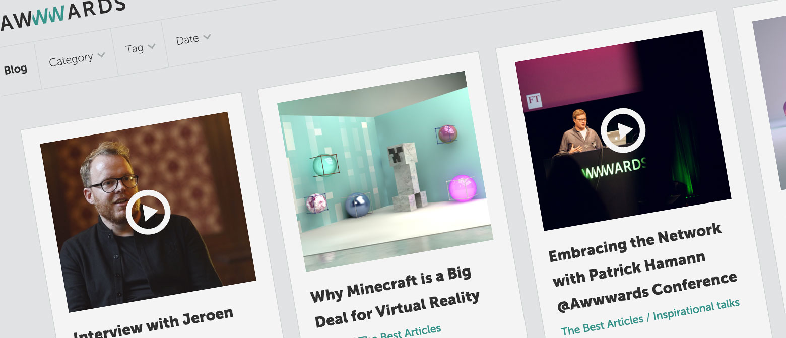
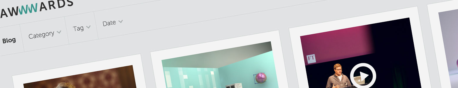
Awwwards, we had to get these guys in for the subtle transitions they have on their blog site, as you scale the screen down, slightly growing, easing and bouncing to restructure the page. Great subtle bit of work.
4. Keep it clean
The general design should be limited to ensure clarity and readability. This can be hard, as naturally we want to spruce up that white space, but when it comes to a blog, clean lines and white space is the best way forward. There’s many arguments in this area, but you have to remember, the user is already familiar with a certain blog post formula and when you change this, you risk confusing the reader and therefore possibly losing them. People have an expectation when they come to a blog, generic conventions, they are already prepared to read, so by having flashy images, animations and a confusing blog structure, this can sometimes disrupt what should be a seamless journey.
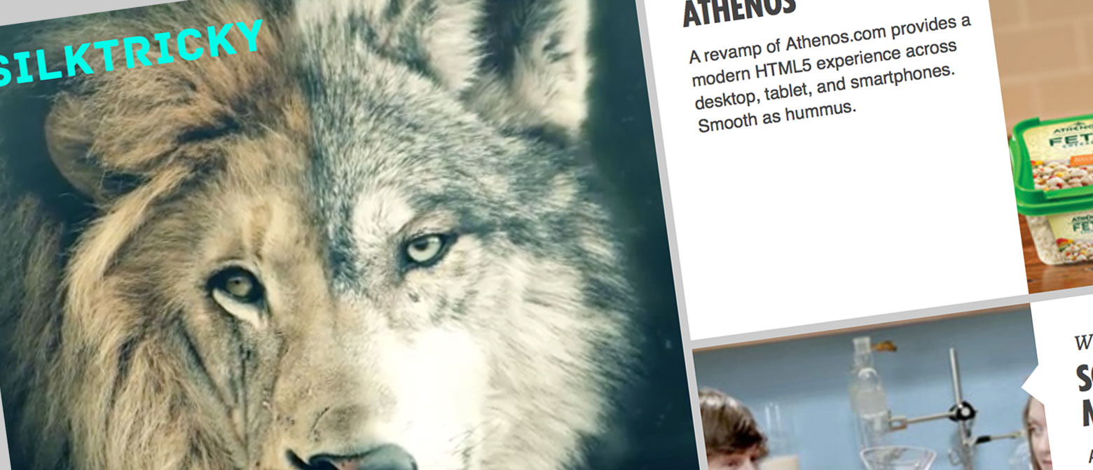
Silktricky have cleverly incorporated video with static visual to create a very clever blog. The video subtly moves on a looped gif making it have a Harry Potter newspaper/ holographic feel. Another great way of attracting attention to your post, not too flashy just subtle.
5. Imagery
Again this comes down to the content, but whatever images you use they need to be carefully considered and not just thrown together, as this can confuse the reader. In our industry, we would expect top notch images/vectors, as that’s what we do each day and essentially get paid for. If executed badly, you would start to question the validity of the article, as if something like an image is wrong, then maybe their research or even their opinion may be flawed. Therefore selecting relevant images and cropping screenshots carefully can mean the difference between keeping a reader and losing them. Of course what these images are is completely up to the design / writer, whether it be a vector, a photo or an infographic, as long as the crafting, cropping and treatment of the images are well executed, the article should sing.
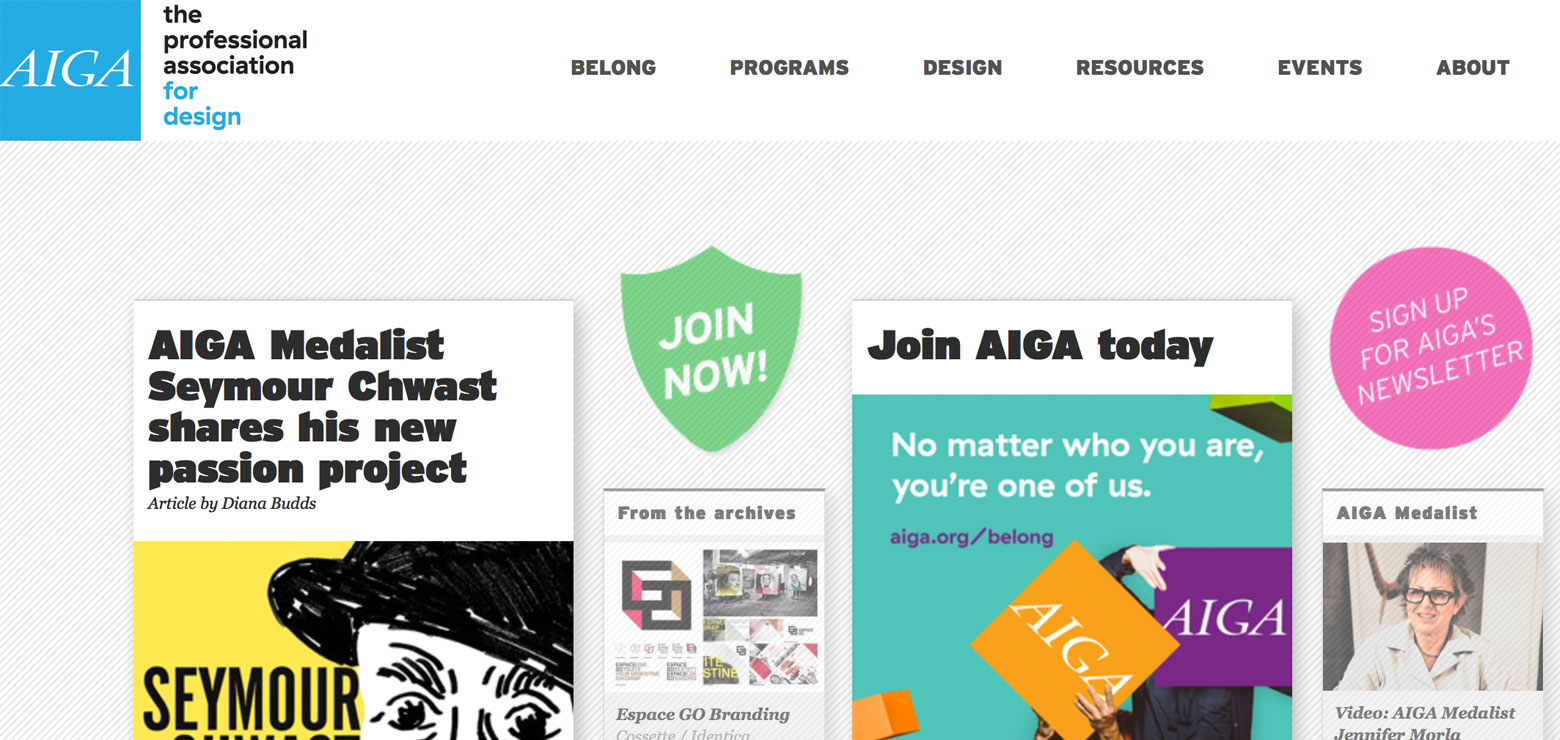
AIGA’s blog site is a series of clean boxed off articles with quaint almost sticker like vectors in between the posts, which draws the eye, acting a bit like a pinboard of articles which reflow as you scale your screen.
6. The link bait
Having a good, juicy link bait is integral to engage your reader. Think controversial, humorous or maybe piggy back on a reactive topic such as a trend or new product release. For instance you’ve written a post on an apple cider brand’s rebrand, why not think of a clever link bait to do with Apple computers, one of the biggest clicked on words on the internet? As long as you don’t mislead too much this can be quite effective.
7. The date
There’s a lot of speculation out there on whether this is a good idea or not. Personally the date says a lot about the regulatory of a company’s effort on their marketing, for if they haven’t posted in a year you may start to question whether they may be too busy in other areas too or just have no interest in exploring the design world and sharing ideas and tips. However, if you are a company that doesn’t have much time to post and only do so say once a month, you may not want to publicly show this with a date, so removing it also works. Ultimately it’s down to the brand’s preference.
8. Reading time
This is something that’s come in over the past few years and can be useful for the reader in managing what time they have and if to save a post for later. On the flip side it may also discourage dependent on the length of your article. Just be wary.
9. Cross linking
A great way to build relationships with other bloggers and to get your own content shared is to cross link your research and facts. In a world of personal influencers who have hundreds of social media followers, this can help other bloggers as well as being a great way if you ask them, for bloggers to share your content also, creating a community and mutual marketing strategy.
10. Sharing on Social media
This is something that almost every blogger will have inevitably had issues with from time to time. Promoting your posts on social media. Most CMS will allow you to manage the imagery and copy snippet in the social settings, but for some finding the correct sizes of header banners and ensuring that when pulled through it shows an intriguing enough section of your image to engage readers can be a nightmare. Check with your developers whether your system supports social content management, alternatively, check out each individual social media’s guidelines before posting to ensure it crops your image in the right place.
