Let the games begin
5th August 2016
Branding is an integral part to a company’s identity. It’s the core to communicating your voice and values that will captivate audiences and create followers. As well as what your brand stands for, your ident needs to be clever through its reasoning and on point creatively and visually, to guarantee that your audiences are on board from a trend perspective as much as the core values you endorse.
This brings us to our best of the web topic this week, one of the world’s most recognised brands and very current and relevant to our sports calendars to date, it’s the Olympic’s identity.
Quick Olympic Fact
We’re all familiar with the 5 ring worldwide base ident for the Olympics, but do you know what the rings stand for and why the colours?
Answer:
The five rings represent the 5 world continents, Europe, Africa, America, Asia and Oceania. The ring colours including the white background symbolise the worldwide flags at the time of its creation in 1912 by Baron Pierre de Coubertin, a French educator and historian.
As well as the main olympics worldwide identity, each hosting nation has the chance to select from their top designers, to create an identity that will theme and endorse their hosting throughout the games. The host identity is then supported by a mascot which is usually relevant to the country it’s from.
But identities don’t just stop at the mark itself. Another universally symbolic attribute of the games is of course the torch, its flame and the bearer.
Quick Olympic Fact
Where does the torch symbol come from? What is the reason for the Olympic flame?
Answer:
The flame originates as you would expect, from Ancient Greece. Based on the theft of fire from the Greek god Zeus by the Titan Prometheus. The idea of the torch was lit officially in 1928, at the Amsterdam games. The flame symbolises the power, strength and spirit of all those that crave to be the best and is transported around the hosting country to spread that spirit to its people.
Did you know?
It is common for the torch to accidentally or deliberately be extinguished. To prevent this and to save the spirit from being distinguished with it, the flame is divvied up across numerous torches and are all set off at the same time in a sort of relay, so that if one goes out, the same flame will still thrive somewhere else.
In true spirited and thirsty for the games to begin style, we’re revisiting the last 5 Olympic logos (including Rio) to look at what it is that creates such a strong reaction every 4 years.
SYDNEY 2000
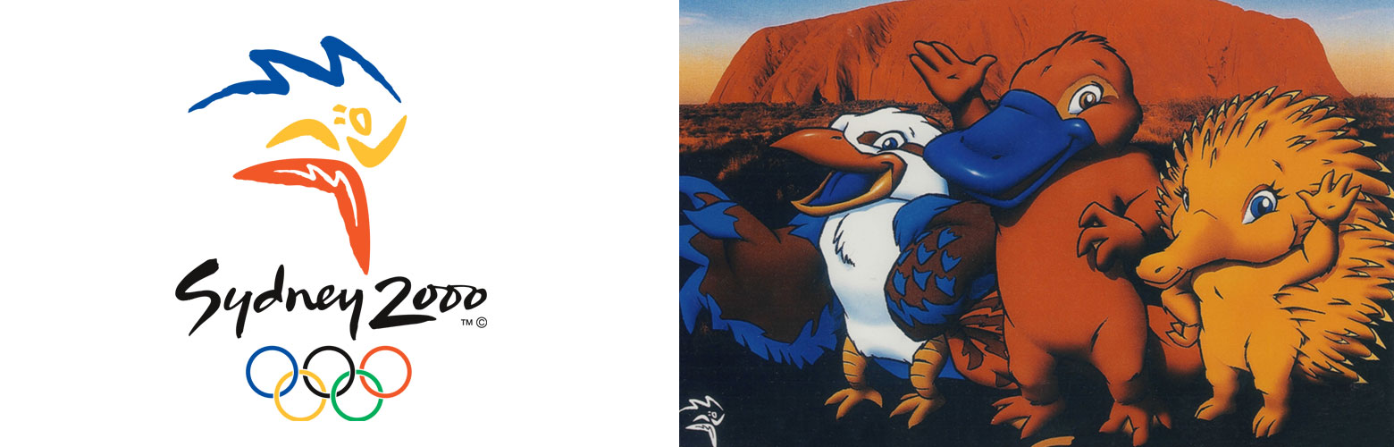
Designer:
Michael Bryce
Font used:
ITC Binary
Mascots:
Syd, Olly and Millie, a hedgehog, plattipus and bird, symbols of Australia.
Reasoning:
The logo was designed to encompass the stereotypical visuals, both in shape and colour, of Australia such as the boomerang, sun and beautiful ocean. The brush and loose treatment and landscape created by the design is very unique to the country.
Verdict:
It’s hard for a country not to stick to its stereotypes, as these are what makes it universally understood. However sometimes we find that it can almost be a safe bet and not always the most direct. Slightly disgruntled by the somewhat obvious iconic route, the treatment on which the brand has been put together is very well done and very of its country’s aboriginal ancestry. There’s something almost tribal about the ident, even down to the primary colour palette, which is what the games are, raw and purely about talent, stripping everything else back and concentrating on the ability and its reward. The mascots, although a little cheesy and again incepting with the Aussie stereotype, gives off an American football game feel, which again is essentially what the Olympics is about, spirit and physical excellence, so although not the most creative solution out there, it’s understandable why these have been used.
ATHENS 2004
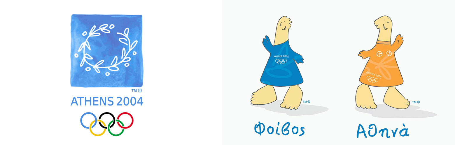
Designer:
Wolff Olins and their Greek partners Red Design
Font used:
Gill Sans
Mascots:
Athena and Phevos, based on thousands of years old dolls found at archeological sites in Greece.
Reasoning:
The identity that consists of an olive branch is based on the official award given to Olympic champions, the wreath or kotinos. The font to accompany this mark is Gill Sans, primarily chosen due to its resemblance to ancient stone cut inscriptions found throughout Greece.
Verdict:
The textured blue background has a very Greek feel and symbolises the stunning blue seas the country is famous for. This seems to set a platform for a loose, freeform sketch illustration style, adopted in the iconic wreath that the patch encompasses. Although quite child like in appearance, the sketchy style seems to have an almost raw, early feel, which could symbolise the Greek champions roots and backgrounds. The lettering however just doesn’t seem to compliment the logo at all. Although selected for the similarities it shares with some ancient Greek carvings, the sharp sans serif font doesn’t compliment the naive sketchy style that dominates the remaining identity. It almost could do with reducing the font to lower or title case to soften it a little and to blend the two elements, opposed to repelling them, what do you think?
BEIJING 2008
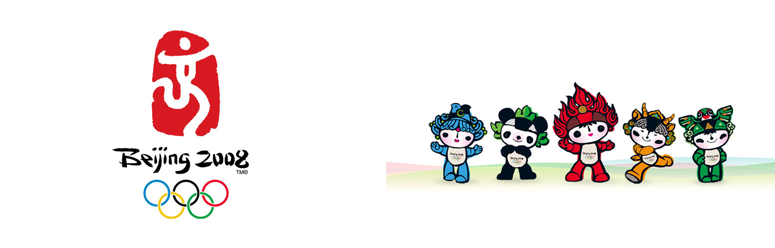
Designer:
Guo Chunning
Font used:
Bureau’s Agenda Medium Italic
Mascots:
Beibei, Jingjing, Huanhuan, Yingying and Nini. Their five names together – “Bei Jing Huan Ying Ni” – translates as ‘Welcome to Beijing’.
Reasoning:
As with most Chinese culture, the Olympic identity is riddled with symbolism and meaning. The name of the logo, ‘Chinese Seal, Dancing Beijing’ acts like an ancient Chinese expression itself (Crouching tiger, hidden dragon). The white dancing man is called ‘Jing’ from the capital’s name ‘Beijing’ meaning capital. The logo is a pinnacle of Chinese heritage and belief, where traditionally a person would sign something and add their own seal. This being a symbol of commitment as we do in our culture. This is relayed through the logo.
Verdict:
Very traditional Chinese, of which would have been a shame for the designer to run from the stereotype, instead here as embraced it and very well. The running man is a particular favourite, especially with the little red blob in the centre of the man. This could symbolise the heart of every Olympian but is subtle enough like the Fedex logo’s arrow in the white space. Of course it had to be red, being an extremely important colour in Chinese culture, along with yellow and green, all of which are seen as lucky colours in China, red being the biggest luck bearer of the three; which is beautiful how the logo itself wishes luck to all it’s Olympians.
What makes this identity sing however, has got to be its mascots. Meet the 5 Olympic rings in true Chinese art style, as characters.
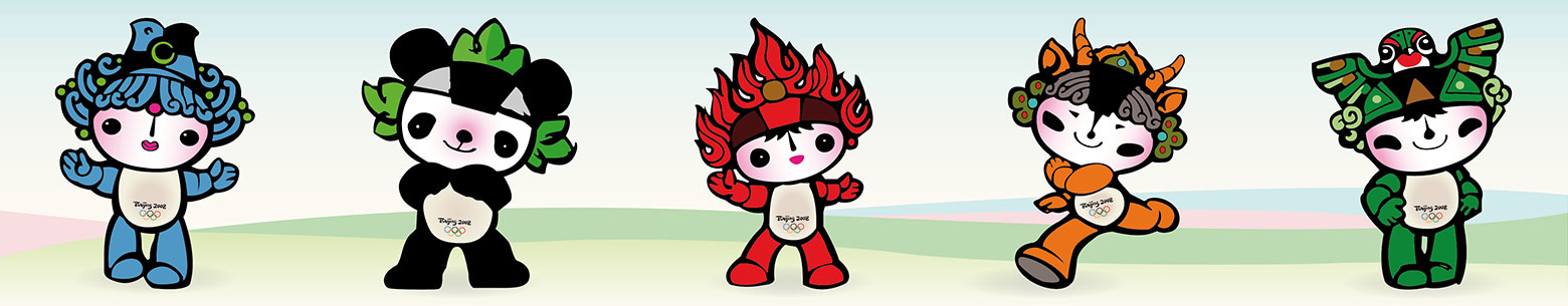
Beibei (blue ring)
Symbolising a fish, Beibei is an icon of abundance, along with its partner ‘water’ in Chinese culture.
Jingjing (black ring)
A giant panda, another icon of China, and protected by its people for its beauty and worldwide appeal. A symbol of the country’s treasure.
Huanhuan (red ring)
Of course, a symbol of the Olympic flame. Representing the enthusiasm and passion for the games and is the biggest brother to all the other ringlings.
Yingying (yellow ring)
A Tibetan antelope, symbolises the vast size of China as well as being unique to the area the Olympics were hosted.
Nini (green ring)
The baby of the bunch, Nini the swallow. An icon of innocence and tradition, swallows have been used in Chinese kite design for centuries.
The clever side to this logo in particular is the cross between tradition and heritage with a very subtle blend of the new, hip and trendy characters but still retaining the Olympic relevance. Very very clever and enjoyable.
LONDON 2012
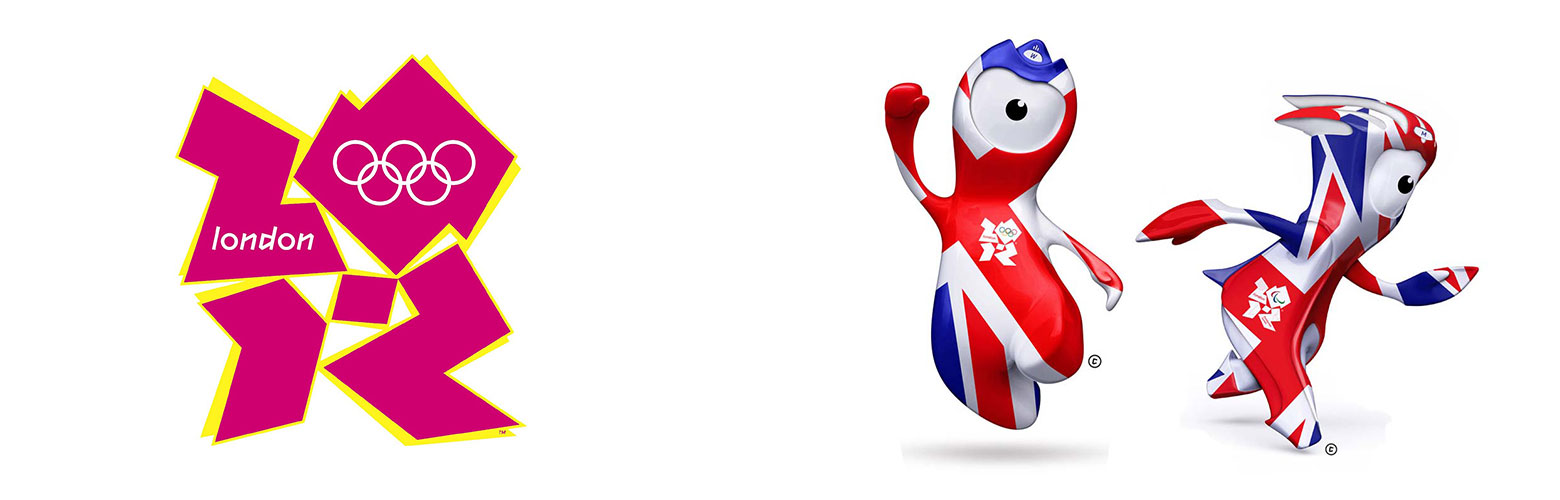
Designer:
Wolff Olins
Font used:
Gareth Hague’s 2012 font with TFL’s Johnston typeface.
Mascots:
Wenlock (Olympic Games) and Mandeville (Paralympics)
The two characters are the last drops of steel left over from the construction of the final support girder for the London Olympic Stadium.
Reasoning:
The idea for the London 2012 logo was to create a brand for everyone, making it trendy and appealing to youngsters enough to inspire as well as retaining the tradition of the games themselves. Numerous discussion groups to what youngsters wanted out of their brand were implemented and what came out of these groups was to create a bold, spirited identity that would have energy and legs to be carried through the rest of the games and not just to resound in the logo as other logos have done previously. A special grid was created in which the logo was drawn, this grid was then taken forward to create the rest of the identities throughout the Olympics, giving the brand consistency and uniformity.
The original intention of the designers was to colour the logo white, to allow the public to download the identity and create their own brand, by filling it in, making it more personal. The nervousness however was the strict brand guidelines of the Olympic rings that must be included in every host identity. So the rings were incorporated into the logo itself, opposed to the stand alone solution adopted by previous and future logos.
Verdict:
Although a huge controversy at the time, I always liked the London logo. If you forget about the actual year 2012 in the identity and treat the design as just shapes, the brand has more meaning and intrigue. The edgy font and jagged edges almost remind us of little islands, symbolising the four parts that make Great Britain up, Scotland, Northern Ireland, England and Wales. The shapes alone had many legs for carrying through to the vast amount of Olympic signage and collateral, but simple enough and not stereotypical enough to follow the past logos. It was a brave design that stood out as it was different, which should be commended and eventually was by the end of the games. The identity’s intention was to bring the British nation back into sport by inspiring and dominating our screens. And they got their result. A BBC Radio 5 live poll found that a collective Games inspired 1 in 5 people in the UK to play sport. Not bad going for such a little controversial logo.
The mascots however, just don’t seem rightly placed next to the identity. They almost seem like souvenirs you’d find in a little tat shop in Leicester Square. Very stereotypical and drenched in union jack. Not a favourite.
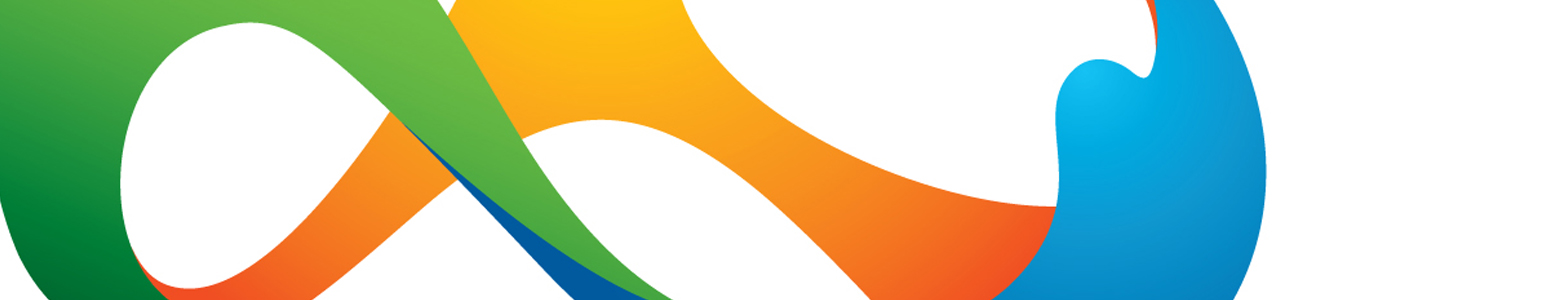
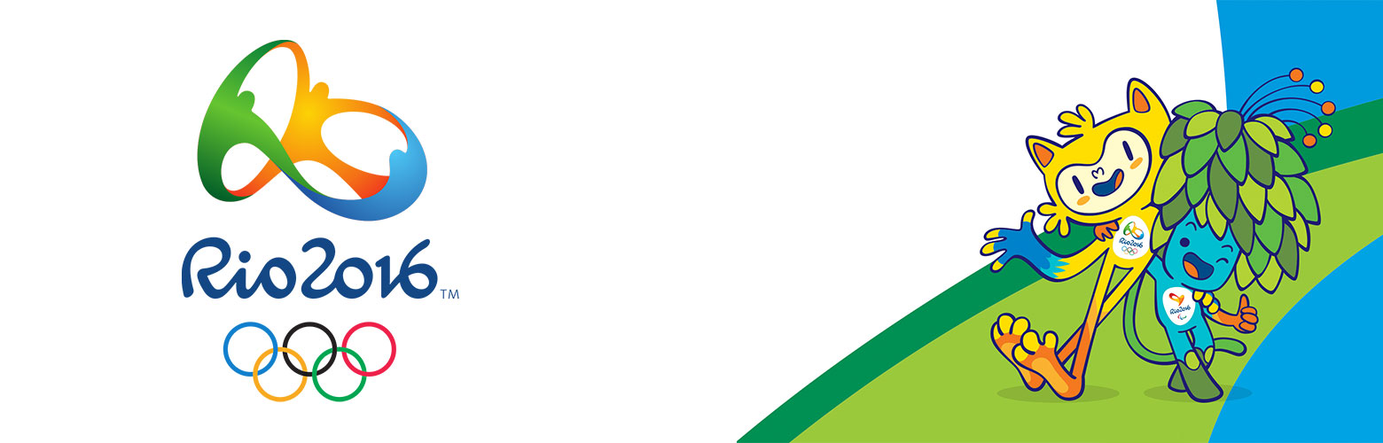
RIO 2016
Official Identity
Paralympic Identity
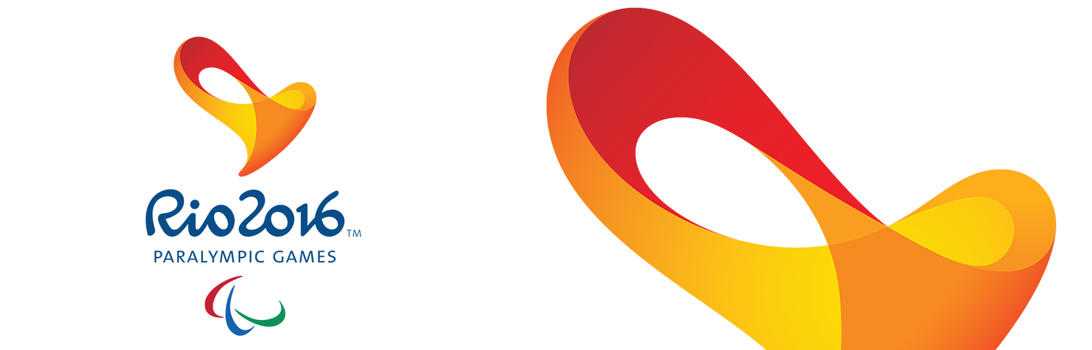
Designer:
Tátil Design and Frederico Gelli (two firms) the Rio 2016 logo was made by Brazil’s Tátil Design de Ideias
Font used:
The Rio 2016 font. An exclusive Olympic font constructed by Dalton Maag, a British typeface firm that has a satellite office in Brazil.
Mascots:
Vinicius (Olympic Games) and Tom (Paralympic Games) Vinicius is a bright yellow mascot, meant to represent a combination of all Brazilian animals. There is also a separate green leafy hair Paralympic mascot called Tom, representing the green vote, all of Brazil’s plant species.
Reasoning:
Based on Brazil’s contagious energy and the people that make the country so vibrant and evocative. As well as the vast energy of the island, the identity is inspired by the rich landscapes, lush waters and golden beaches of Brazil that the country is famous for.
Verdict:
Probably a personal favourite, both the colours and interlinking icon is contagiously beautiful and evocative. Almost looking like the infinity symbol, the country brings together its most treasured pocession, its people into the logo, interlocking them into a never ending energetic circuit. Almost having a festival, dancing feel from the positioning of the 3 integral elements, each interlocking being reminding us of another highlight to the country, it’s shores, rivers and lush forests. The font is just as fluid as the shape of the logo itself which is ingenious. Even down to the mascots symbolising the animal life and plant life on the island, the consistency and encompassing of all the mighty elements the country has to offer is right on the money.
What can we take from this?
We all know how big branding can be and whether we find it easy to design or not, the potential of one little mark can be great. For such a small identity, a huge thing can grow, whether its symbolised through a mascot, a value or an idea, respecting and understanding the potential of this will make our design decisions and solutions more fluent and inkeeping with what the audience needs and aspires to see. Although this is very evident in branding, we need to remember to push boundaries and dare to be different like the London identity did, as well as maintaining a sense of tradition and nod to our own style, like China.
Good luck Great Britain!
Let the games begin!
