Retro vs contemporary branding
10th November 2016
2016 has been a year for rebrands, from Mastercard to Co op, the industry is saturated with companies reinventing and refreshing their identities. Rebranding has always been a great way to stir up media attention, attract new audiences and get people talking, enabling brands to test their ideas and to keep fresh to modern trends, all the while keeping their consumers engaged. However, we have continually seen a common trend in the industry over the past year, finding brands revert back to their heritage and reworking their older identities, bringing back nostalgia and familiarity. But does this retro style still work in our modern day world? Or are we trying to shoehorn our brand’s roots into our identities and not quite pulling it off?
So what brands use this retro styling in their rebrands?

Lets have a brief look at Pepsi vs Coca Cola. The long time chicken and egg, marmite love hate argument that has divided the world for years. Coca Cola have stayed pretty consistent in their identity for many years whereas Pepsi have adapted their ident to the trends of the time becoming quite contemporary. Which one works most do you think? What would have happened to the brand Coca Cola if they had taken the contemporary styling? Pepsi originated from a similar script font but adapted with the times, trading in the old typographic lettering for a more sans serif feel, but does this make them more ‘down with their audience’ or that they don’t have enough confidence in their brand to stick with their design?

Different brand values
Pepsi’s brand values have always been to keep themselves contemporary, in both product and identity which is why the giant changes their brand more often than Coca Cola. Also, with over 123 years of history, if the brand was to stick with a logo, then they would lose their main younger target market that they pride their brand to adorn to, their ‘forever young’ tradition has to keep youthful to each new generation, which is why we see so many logo changes. Whereas Coca Cola pride themselves on their tradition and therefore plays on this in their advertising, like the famous nostalgic figure Father Christmas showcased on their lorries coming over the hills in the yearly ads, repeated most Christmas’, which is why they rarely change their logo, as why adapt something that is spot on their brand values. So although we think of the two giants as in direct competition, in fact, they generally target two completely different ends of the market, from traditional to the new generation. They may occasionally dabble in each other’s markets, like Coca Cola did with their personalised cans, but stuck very close to their branding, not deviating away too much from the traditional logo and design, both retaining their old reliable audiences.

NatWest have also had a very retro rebrand as of late, maintaining their iconic 3 shape structure, but pulling on a more isometric feel, that likens the identity to many of the older 3d typographic poster styles in the past. Giving the brand a completely new dimension in which to play with in its collateral, making it a more visual and colourful brand than before.

Why so serious?
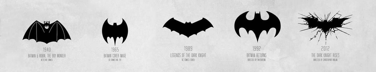
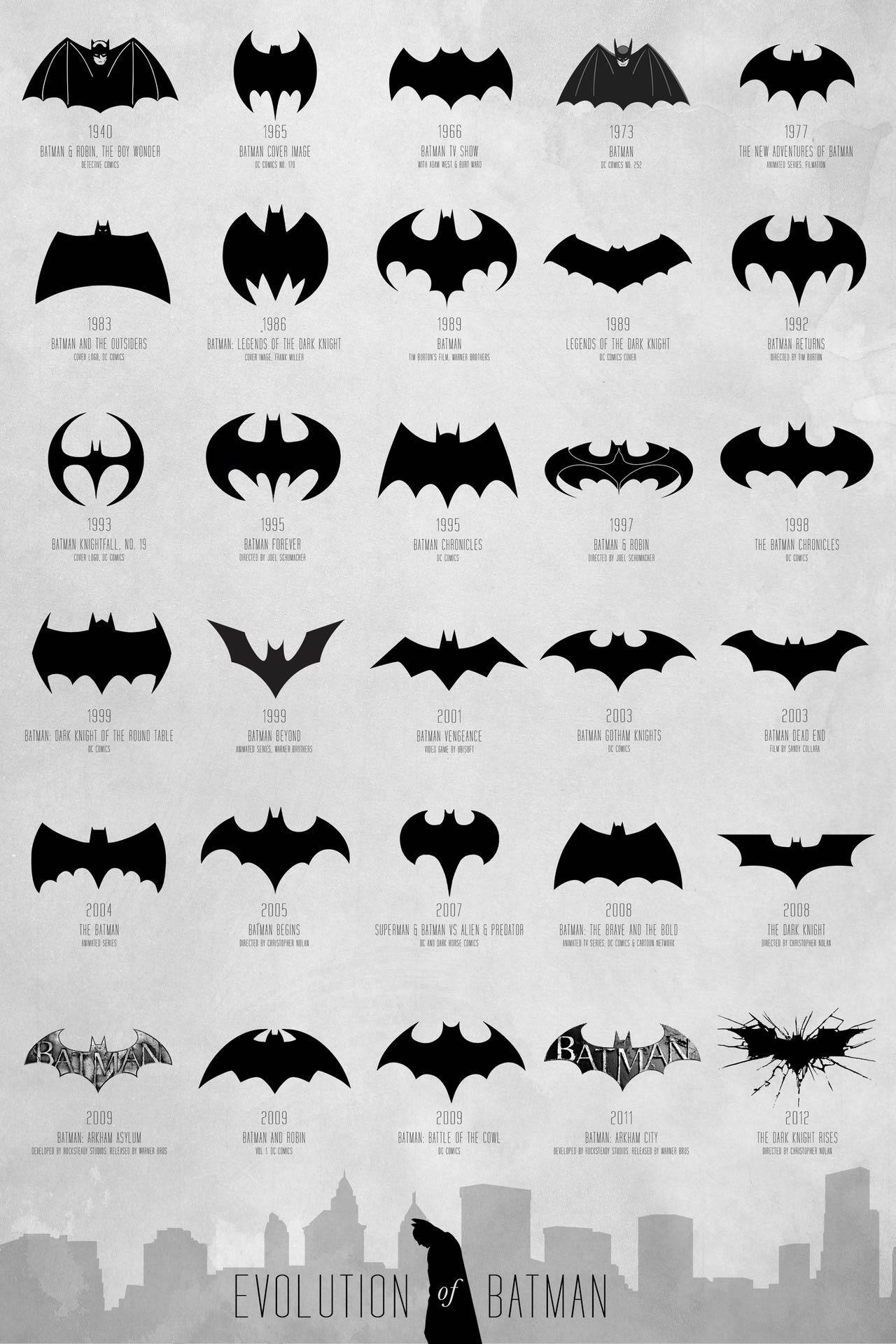
And it isn’t just the retail and commercial markets that have seen their identity change over the years, a very well known figure has seen many rebrands throughout its time on our screens, Batman. An iconic logo that needs no introduction, which makes it all the more powerful in what the icon looks like. Of course the persona of Batman has changed throughout the years as well as the actor and directors, each being a contributing factor in the logo’s redevelopment. From simple, to cartoon like, to the modern highly illustrative dark icon, we have our favourites, what’s yours?
Conclusion
So, is it best to take inspiration from our past in designing our new identities? The answer is… the decision lies with the client. The needs and reasoning behind why we decide to rebrand should dictate the why. Whether it’s from wanting to reach more audiences, to refreshing your design purely in hope of keeping your brand up to date or to tidy up your identity like Coca Cola and not changing something that just works, it’s all down to the path the brand sets out in their plan, of what they want to achieve as a company and their values. As long as we have these answers in mind and maintain our awareness that retro isn’t just a temporary trendy plaster, then we will find the rebrand process more fluent and get the ideal solution at the end.
Want to find out more?
For more information on the retro trend, checkout Creativebloq’s article.
Who else has rebranded? Why not have a look at our rebrand run down blog post Rebrands, the good, the bad and the ugly.
