
Signs that your website is boring users
8th May 2017
As creatives we are natural entertainers, from the way we speak to how we take in the world around us, our lives are a constant stage for us to perform creatively. The work that comes from this performance is yet another extension of our personality, so making sure our solutions are as creative and captivating as possible can be an ongoing challenge. No matter how well we may think we have designed something, invariably in such a changeable world as ours where opinion is a plenty and technology is constantly updating, there will always be something we’ve missed and with it, those of us that will communicate this from clients to our users to potential customers. Mistakes however, are an essential part of our growth as creatives, in which we need to learn and grow from, it’s how we physically address these negatives and positives however, to how strong the final solution will be. The trick is in taking these comments and actioning them to create a more overall informed and engaging solution to not only bring further strength to our brand but signpost to our users that we listen and take their opinions on board. But where could mistakes be looming?
Online presence is a powerful tool to brands and individuals alike. We’re seeing more and more employers check potential employee’s online stats on social media and websites as a tool to help make their employment decisions, presenting your website as an essential piece of kit in getting your presence known. Whether it’s your own or a client’s, a website is one of the first impressions and point of call for your consumer to find out who you are as a brand, what you’re about and what you’re selling. However, it’s not only the actual presence but how you create it visually and functionally in how you’ll be rated by customers and employers alike, making a captivating website all the more important to keep your user fully engaged. Functionality and content will however vary from site to site dependent on the type of session and purpose, whether e-commerce focused relying on more support networks such as live chat or customer service to informative brochure sites that need tighter content in which to engage, whatever the purpose, these basic rules can be a handy list to help you fully captivate your audience’s attention. But how do you know if your site is boring users?
8 signs of website boredom
Everything that makes up our brands, from spelling to the detail in the content we write, collectively build up our brand’s personality and values, making getting the content right half the battle in maintaining full user engagement. To explore the signs further we’ve split our top 8 into a bitesize signage infographic with further descriptions below. Is your site guilty of any of these warning signs?
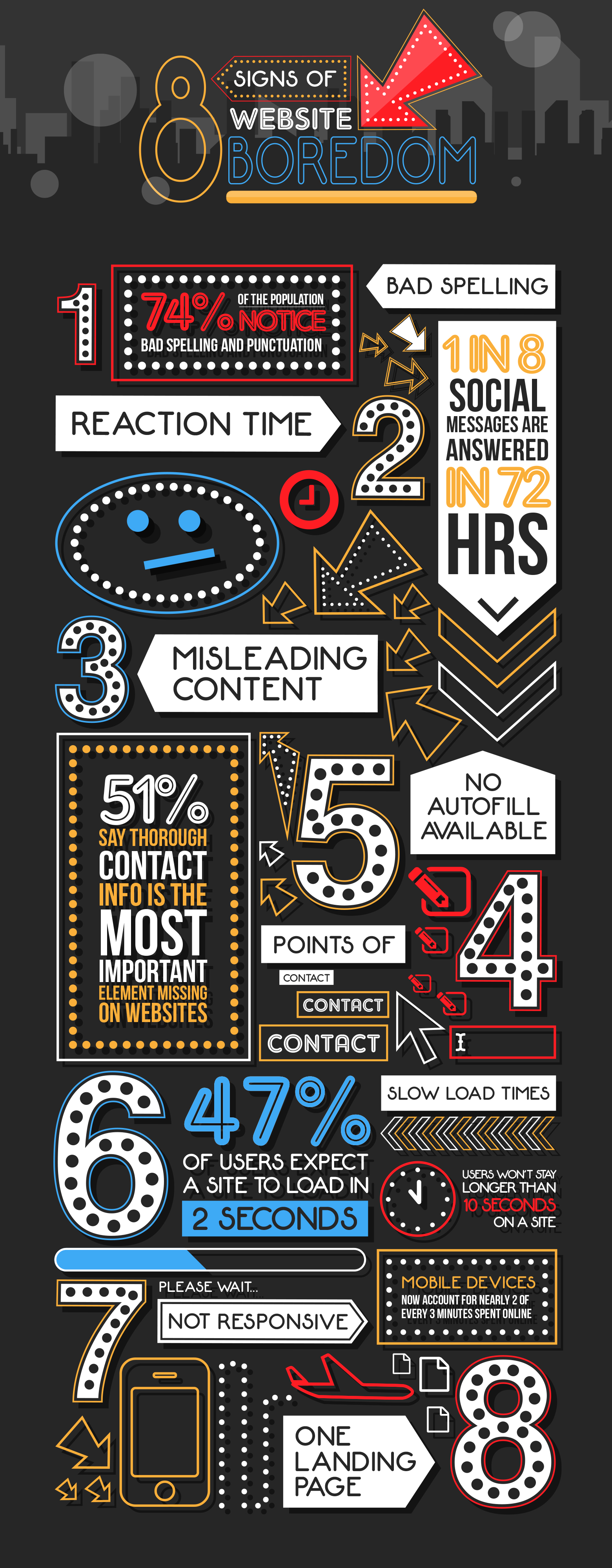
1. Bad spelling
One of the most expected basic checks that you would think is obvious, but so many sites still fail on, basic spelling. This small check if not done can be detrimental to a brand’s reputation, possibly making your clients lose faith and wonder if your lack of care on your own site may reflect on theirs. Plus with the spell checker as a basic element of any design software these days, it’s just plain lazy not to do it. Doing a thorough spell check and crafting any hyphenation issues will ensure your user won’t switch off. (Source: Real Business)
2. Reaction time
Keeping up to date with your blog, news and company changes is integral to a brand’s growth. Keeping on top of social media regularly and any comments or questions within the first 24 hour period should be priority in keeping your audience happy. (Source: Sprout Social)
3. Misleading content
Our time is so precious and although we all love to learn and take what we can from the content we invest time in reading, one of the biggest turnoffs for any user is to really get into an article to realise that it is just a generalisation about a complex subject. Misleading the user by erroneous headlines and sneakily crafted snippets that don’t deliver the answer or generalises and surface skims a subject will deter your user, diluting your brand’s integrity.
4. No autofill
With the majority of users accessing content via their devices, there’s nothing worse than getting to a form or survey and having no autofill filter. Ensure you activate this on your site to stop user frustration.
In such a tech savvy millennial dominated time as ours it makes sense that one of the major issues with most sites these days resonates in the functionality of a site. From the design to essential technical features could you be guilty of these signs of bad functionality?
5. Lack of contact points
A point of contact on a site can seem obvious, but are you offering enough methods? For instance the millennial audience prefers email or live chat feeds whereas other generations prefer a more telephone point of contact. Are you offering the right ones? Some sites even offer all three. (Source: KoMarketing)
6. Slow loading time
Our time is valuable so a site that makes you wait is one of the biggest turn offs. (Source: Kissmetrics)
7. Not responsive
We touch upon this continually across all manners of design but it still remains an integral element to maintain user engagement. By not having a mobile journey or having one that is designed badly can be an instant turn off. This has become an expectation by users and if you don’t comply you risk losing customers altogether. (Source: comScore)
8. One landing page
A singular landing page is great as an initial presence for a new brand but not updating this with further pages as you grow can be a major no no to returning visitors expecting the latest news and developments. Part and parcel of this is the imagery, from the relevance, cropping and use of photography on your site sets your brand style and keeps your audience engaged.
Most important rule
We’ve logged these signs, made note of our site’s errors, there’s only one thing left to do, action them. Feedback, stats and the data we acquire is only as valuable as the person or company who uses it. You’ve taken all the trouble to collect the data so use it, amend and carry on. By doing nothing you will continue this cycle and as well as losing potential sales, risk losing the users you do have. Log it, mend it and feel content that you not only have a stronger site because of it but a more invested following from an audience who will feel appreciated and valued that you’ve taken their opinion on board.
