This website is operated by Bopgun and whose registered address is Unit 4 Corum 2 Crown Way, Warmley, Bristol, England, BS30 8FJ (“We”) are committed to protecting and preserving the privacy of our visitors when visiting our site or communicating electronically with us.
This policy sets out how we process any personal data we collect from you or that you provide to us through our website. We confirm that we will keep your information secure and that we will comply fully with all applicable UK Data Protection legislation and regulations. Please read the following carefully to understand what happens to personal data that you choose to provide to us, or that we collect from you when you visit this site. By visiting bopgun.com (our website) you are accepting and consenting to the practices described in this policy.
Types of information we may collect from you
We may collect, store and use the following kinds of personal information about individuals who visit and use our website:
Information you supply to us
You may supply us with information about you by filling in forms on our website. This includes information you provide when you submit a contact/enquiry form. The information you give us may include your name, address, e-mail address and phone number.
Information our website automatically collects about you
With regard to each of your visits to our website we may automatically collect information including the following:
- technical information, including a truncated and anonymised version of your Internet protocol (IP) address, browser type and version, operating system and platform;
- information about your visit, including what pages you visit, how long you are on the site, how you got to the site (including date and time); page response times, length of visit, what you click on, documents downloaded and download errors.
Cookies
Our website uses cookies to distinguish you from other users of our website. This helps us to provide you with a good experience when you browse our website and also allows us to improve our site. For detailed information on the cookies we use and the purposes for which we use them see our Cookie Policy.
How we may use the information we collect
We use the information in the following ways:
Information you supply to us. We will use this information:
to provide you with information and/or services that you request from us;
Information we automatically collect about you. We will use this information:
- to administer our site including troubleshooting and statistical purposes;
- to improve our site to ensure that content is presented in the most effective manner for you and for your computer;
- security and debugging as part of our efforts to keep our site safe and secure.
This information is collected anonymously and is not linked to information that identifies you as an individual. We use Google Analytics to track this information. Find out how Google uses your data at https://support.google.com/analytics/answer/6004245?hl=en.
Disclosure of your information
Any information you provide to us will either be emailed directly to us or may be stored on a secure server located in London. We use a trusted third party website and hosting provider (AWS) to facilitate the running and management of this website. AWS meet high data protection and security standards and are bound by contract to keep any information they process on our behalf confidential. Any data that may be collected through this website that we process, is kept secure and only processed in the manner we instruct them to. AWS cannot access, provide, rectify or delete any data that they store on our behalf without permission.
We do not rent, sell or share personal information about you with other people or non-affiliated companies.
We will use all reasonable efforts to ensure that your personal data is not disclosed to regional/national institutions and authorities, unless required by law or other regulations.
Unfortunately, the transmission of information via the internet is not completely secure. Although we will do our best to protect your personal data, we cannot guarantee the security of your data transmitted to our site; any transmission is at your own risk. Once we have received your information, we will use strict procedures and security features to try to prevent unauthorised access.
Third party links
Our site may, from time to time, contain links to and from the third party websites. If you follow a link to any of these websites, please note that these websites have their own privacy policies and that we do not accept any responsibility or liability for these policies. Please check these policies before you submit any personal data to these websites.
Your rights – access to your personal data
You have the right to ensure that your personal data is being processed lawfully (“Subject Access Right”). Your subject access right can be exercised in accordance with data protection laws and regulations. Any subject access request must be made in writing to Data Controller, Bopgun Design, Studio 12a Greenway Farm, Bath Road, Wick, Bristol BS30 5RL. We will provide your personal data to you within the statutory time frames. To enable us to trace any of your personal data that we may be holding, we may need to request further information from you. If you have a complaint about how we have used your information, you have the right to complain to the Information Commissioner’s Office (ICO).
Changes to our privacy policy
Any changes we may make to our privacy policy in the future will be posted on this page and, where appropriate, notified to you by e-mail. Please check back frequently to see any updates or changes to our privacy policy.
Contact
Questions, comments and requests regarding this privacy policy are welcomed and should be addressed to studio@bopgun.com.

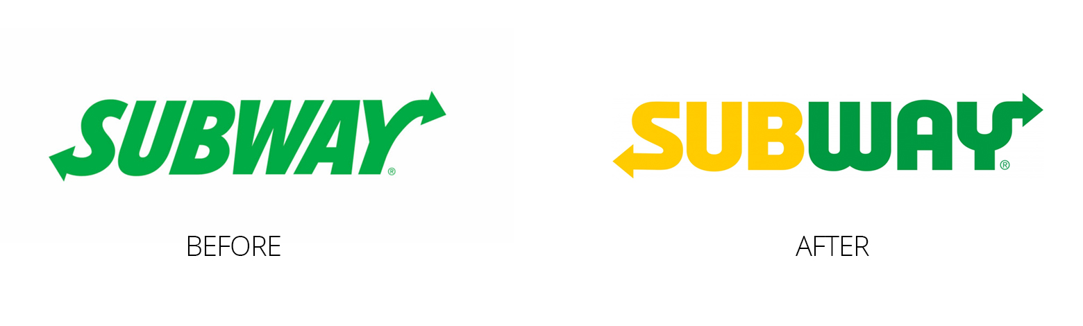 Continuing their flat design look, they have scrapped the italic, introduced both colours opposed to just the green and served up a geometric font. As well as in keeping with their long logo they have also introduced a very successful adopted style amongst other brands and created a secondary ident using just the ‘S’ in their logo, which utilises the two arrows on either end of the general identity to create a white space for the ‘S’ to sit.